how-to projects

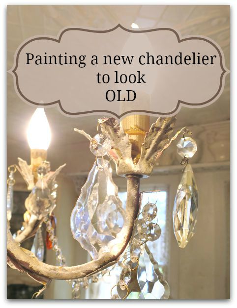
Painting a new chandelier to look old

how-to projects, Kitchen remodel, paintings, Tutorials

Fall decor 011

In the past, I've shared how to paint a vintage, brass chandelier.  It was the one I had hanging in my kitchen before this one. And I still use that technique when I want a full coverage for whatever I am painting.

But for this project, I wanted a different look.  I was replacing two chandies in the kitchen with twin, new, dark copper colored fixtures from Home Depot.

Fall decor 068

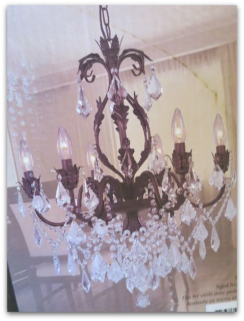
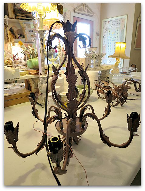
Here is the picture from the box. When I ordered them, I thought I'd like to have the dark bronzey, coppery color as a contrast to my all white kitchen.

But not only did I decide that they were a little too dark, I thought they looked a little… cheap.  After owning a heavy, old, solid brass chandelier, this paper thin metal one was a bit of a come down.  I hoped layers of paint would give it some depth plus keep the contrast I wanted for the room.

Fall decor 057

I'd called the electrician to schedule getting the two lights hung up, just to find out that he had a cancellation that day and could be out that afternoon. 

Ooops.  Too soon! They weren't painted yet. I didn't want to miss the chance to get them up right away, so I looked around to see what I had to work with.

Now, you might remember that I have complained about Chalk Paint. Actually saying that I would never use it again.

Well, I've discovered that it has its uses here and there. I won't use it for large pieces of furniture due to expense, but I have learned that if you buy the small bottles at Michaels or Hobby Lobby with the 40% coupon, it is affordable for small projects.

It always needs sealed with wax or clear coat. I still dislike wax, but am happy with the results of adding a clear coat.

Fall decor 059

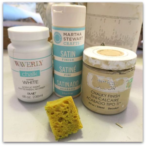
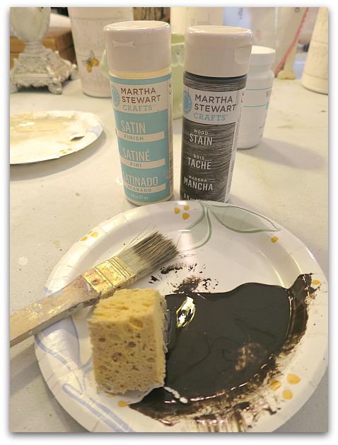
And for this project, I didn't have time to prime. So, I sponged on cream and white chalk paint.

Fall decor 065

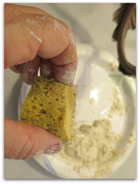
While sponging the two colors together, I was careful to dab a small amount at a time so that the two colors didn't blend completely as I worked.  

I left the crevices dark, not smooshing my sponge down into those areas.  Chalk paint is a good choice for a project like this, since you don't need to prime first. If I'd had to prime, it would've been hard to leave the original color peeping through.

TIP- Being a perfectionist isn't helpful, being a messy painter and a bit slap happy with the paint is a plus on a project like this!

Fall decor 066

After that, I brushed on this water based wood stain that I had left over from painting my cabinets.

Fall decor 067

The stain is brushed on haphazardly into the dark areas and here and there on the sponged areas, and wiped off.  

Then it was covered with a clear, water based. top coat.

By starting at the top of one, working my way through it, turning it as I painted to get every angle, then doing the same with the second one- the first was dry enough to glaze as I finished the second. Same thing with the top coat, the first was ready to seal by the time I finished glazing the second. I was able to get both sponge painted, glazed, and top coated, then set out in the sun to dry in under 2 hours.  

And both were ready for the electrician when he arrived.

Fall decor 010

Don't forget to sponge paint the chain too!  I'm considering whether or not to add some paint to the cord… It doesn't bother me that much like this. But I'm still thinking about it.

Fall decor 009

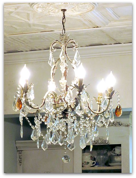
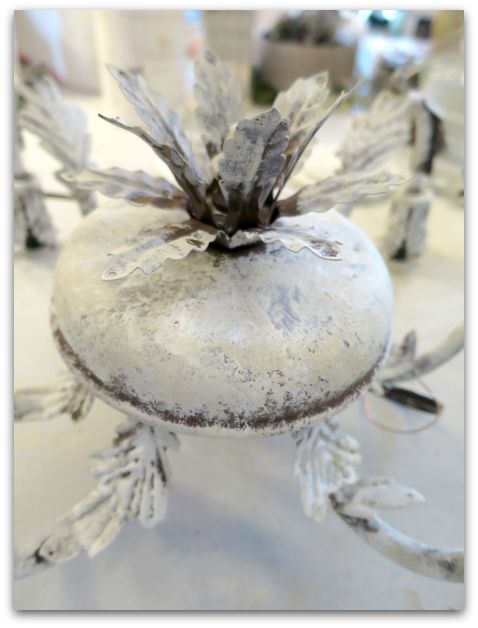
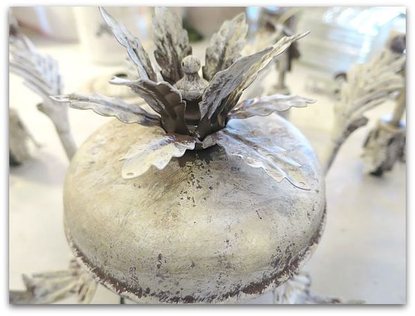
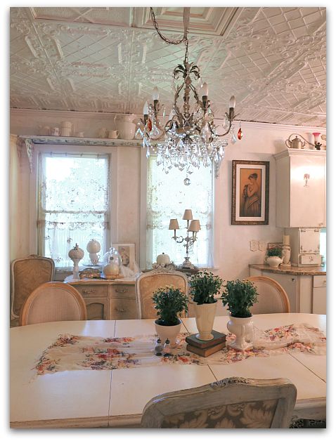
The results were just what I wanted, not as white as my old fixture, and with a hint of the copper showing under my muted white and cream. It is darker, but not starkly so.

The paint makes the light look more substantial and certainly not like it was just shipped from the factory.

Fall decor 058

Here is another before picture.

Fall decor 075

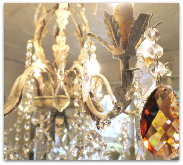
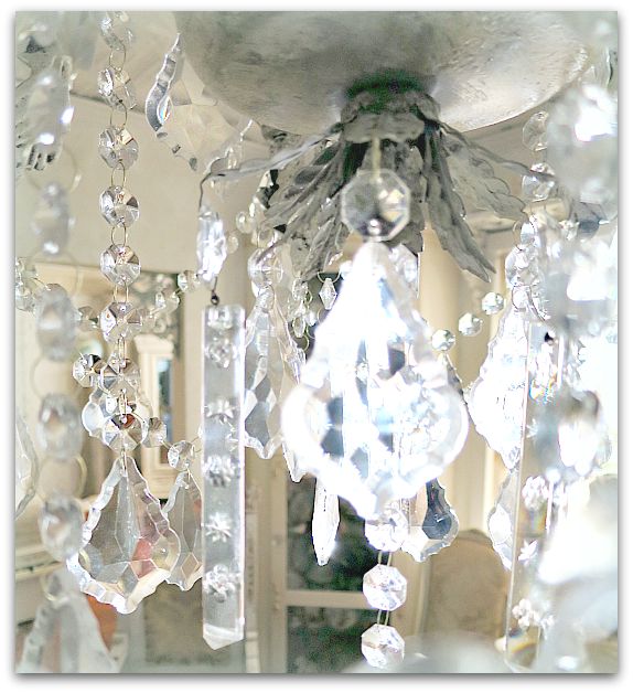
The light came with a lot of glass drops. Not crystals, I could tell the quality wasn't quite as high as the ones I'd had before.

Fall decor 074

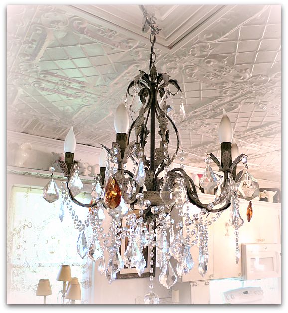
So, I added a mix of the older ones in with the new ones.   Including 3 deep colored, large ones.

Fall decor 084

Ahhhh, that's better!

Fall decor 076

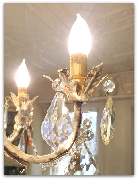
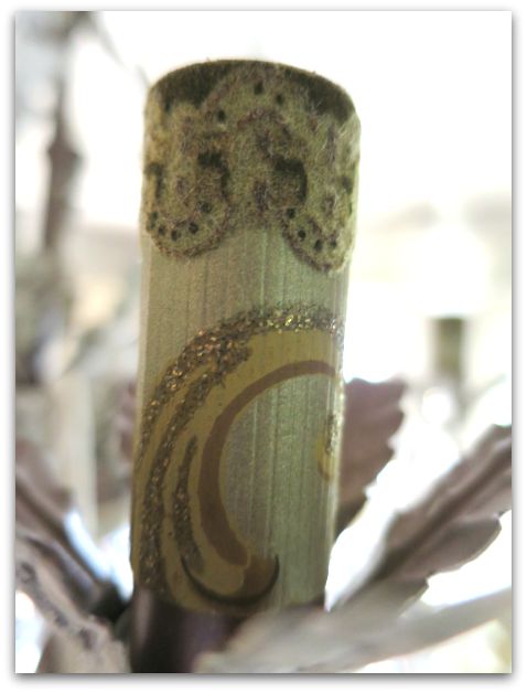
The tubes that slide over the sockets were glaringly blah after redoing the rest of the piece, so I glued vintage wallpaper to them. I thought about sheet music, and might try that another time.  It is simple to slide these off, peel off the paper and glue another type onto them instead.

Fall decor 028

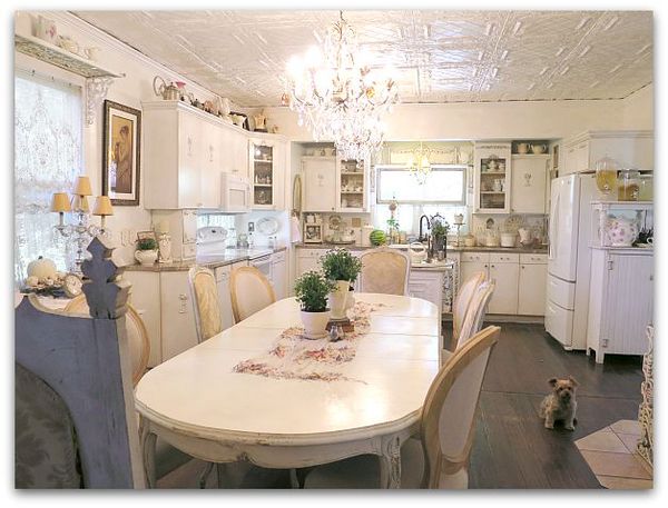
It is honestly a relief to have brand new fixtures with no wiring worries up in the room. The older chandeliers had arms that no longer lit up, and didn't hold as many bulbs. So, when not all of them worked, the room wasn't very bright.

Each of these lamps holds 6 working bulbs.  Very nice!  And I can now re-wire the vintage fixtures for use elsewhere if I decide to.  In the mean time, this was a quick, easy, and pretty affordable redo that still looks nice in my vintagey cottage.

Fall decor 075s

Art Journalling tips on using markers, metallic ink, and opaque white for coloring pages, doodling, and drawing

Books, drawing, how-to projects, paintings

Spells 021

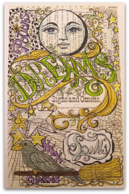
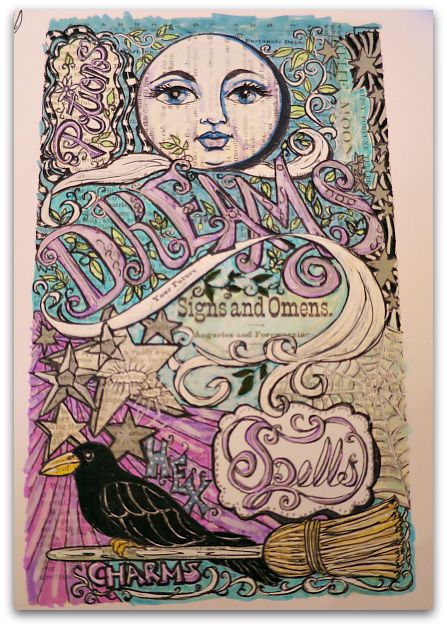
I've been working on a coloring page to add to the Book of Mysteries journal that I'm starting to build kits for (will let you know when those book kits are ready).

When I finish a coloring page, I can't wait to start coloring it in! And it is a good idea to do that, because I find some oddities here and there that might need fixed before sharing it.  I also like to have some examples of how the pages look when completed with color, to give other artists an idea of what to do with the blank pages.  
Spells 022

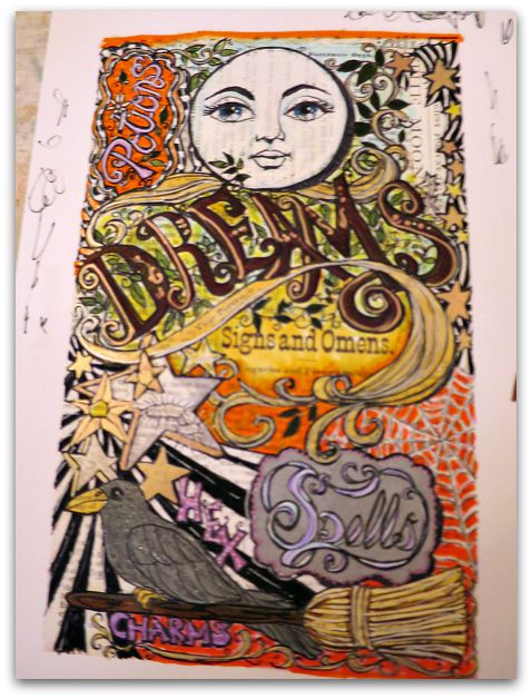
Of course, who could stop at just one? These are ADDICTING.     I spent all day yesterday drawing, cutting and pasting, then tinting the pages.   Here is one in more traditional Halloween colors.
Spells 028

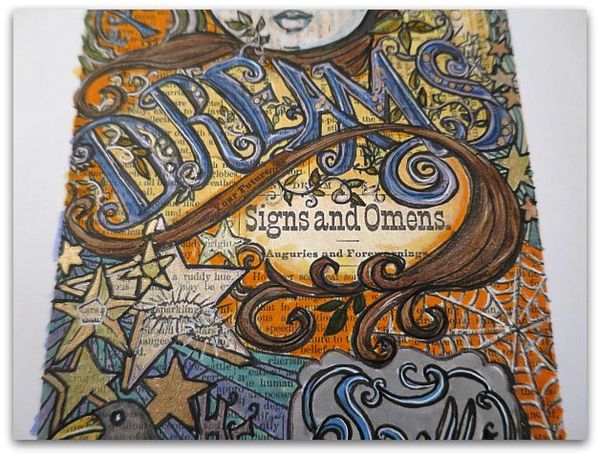
And this one is fall toned.

Spells 010

I thought I'd break down the steps to show you how I layer the markers and pens in case you'd like to make one.

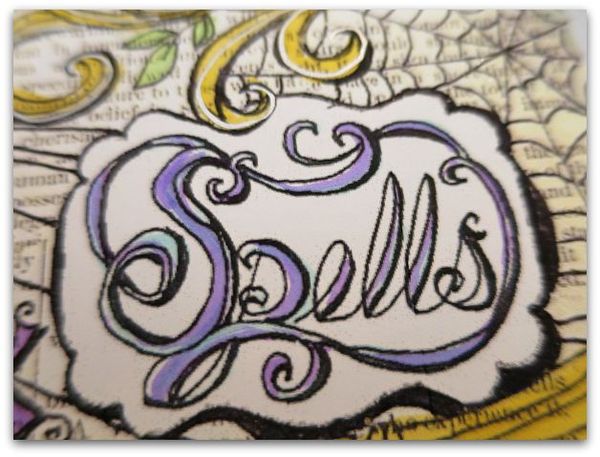
First step?  Light colors as an undercoat.  
Spells 014

The more layers the better. I used a soft blue with pale purple over the letters on 'Spells'.
Spells 016

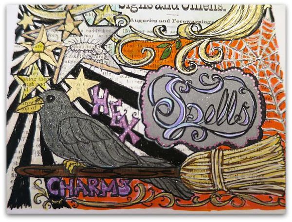
Around the word, I painted in a silver glitter, with my favorite new tools, the Stella Wink glitter pen.

Over that, I used a metallic ink in orchid to do a border of dots.  Then, I redrew all the black lines, and used an opaque white pen to add some highlights to the letters.

Using the white pen to highlight makes a big difference, see how I've used it on the broom too?  Over the pale yellow, I drew some brown lines as shadows, then went over the whole straw area with a darker yellow, and added white highlights over that.

The orchid metallic pen dots on the frame for 'Spells' are repeated on the word 'Hex'.  I like to repeat colors or patterns throughout the piece.
Spells 012

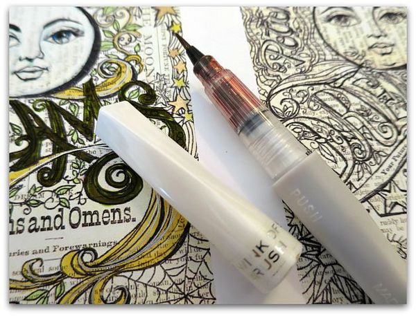
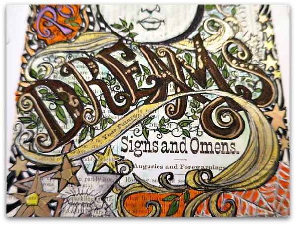
The Wink pens have a thin, brush point and pack a lot of sparkle. I did a layer of the copper over the previously laid down bright green on the word 'Dreams'.
Spells 018

A darker green went over the leaves, and the soft blue was lightly used in the background.  

With a variety of metallic pens, I accented the word 'Dream' , the yellow banner/swirl/thingy, and the stars.

All of these were re-outlined in black afterwards.
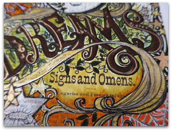
Spells 025

It is smarter to redo the black outlining at the end, so you don't smear it, but I have a bad habit of using it on each area as I work on it, then I have to be really careful with the next step. I'd say do the black last!

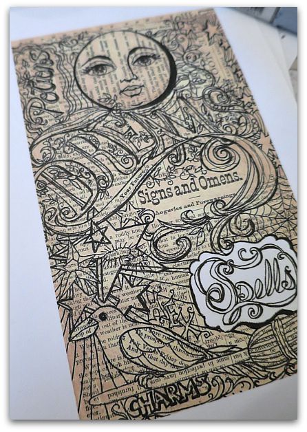
I have gone over the soft blue with pale yellow.  Here and there, not everywhere, I used a blending pen.  The blending pen was used much more heavily over the orange, where I added it along the yellow under 'Signs and Omens.'  

Notice that there are some skips, where I don't completely cover the background? Some of the paper shows through. This is an old, watercolor trick, and it adds sparkle to the page. If you cover the page 100%, it can look flat.   Those little skips give the page some life. 
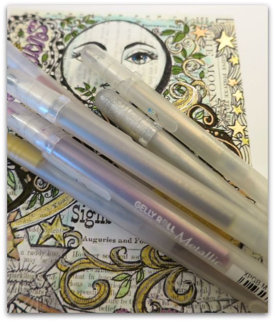
Spells 015

Over the yellow banner, I then drew on some Gelly Roll Stardust in clear, and rubbed it with my fingertip. I adore that look, it is something my Sissy showed me years ago and I've used it a billion times since then.  The Stella Wink pens have a similar look, but don't blend as well, they go on more like paint. I love them both, but if you want just a hint of glimmery shimmer in small spots, you can't beat the Stardust in clear.

Also, using a mix of distress markers, opaque markers, and metallic pens, gives the picture a lot of depth.
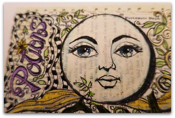
Spells 013

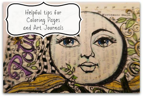
For the moon face, I first washed soft blue over the shadow areas with a Tim Holtz distress marker, basically following the drawn lines. I colored in the irises with it too. Then used a dark blue over the top half of the irises.  Over the entire face,(avoiding the eyeballs, but  covering the eyelids) I used the opaque, white marker.   I made a dot with that over the bottom right hand corner of each iris (same spot, both eyes).  All of the black was re-outlined, and the pupils were blackened, then with the white opaque pen, I added two little dots to them.
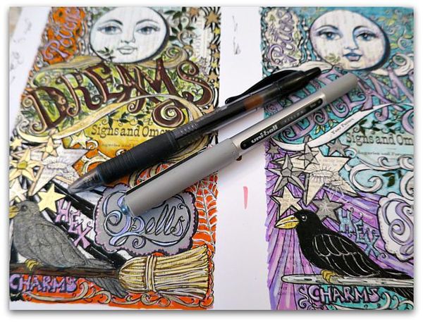
Spells 020

Re-outlining with the black marker makes a giant difference in the completed piece.  I usually work with an art marker, but found that going over metallic pens kills an expensive fine point marker, and the best tool is a uniball or plain, old, ink pen.
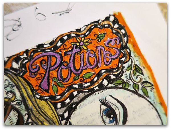
Spells 017

Little details can give you big pay off.  I like the way the black and white check really pops of the the page, but one more step…
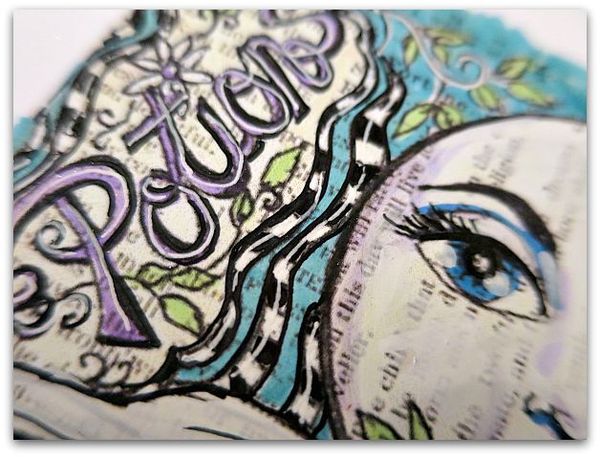
 

Spells 027

Of drawing a line through the center of the checks with the opaque white pen on this page, adds dimension.  I did the same with the purple letters.
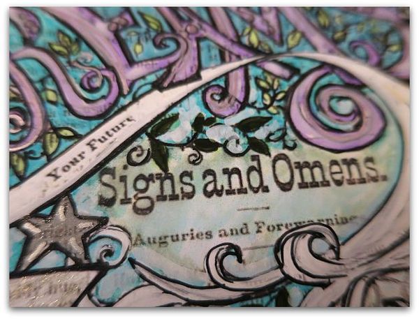
Spells 026

On this one, I drew the banner/swirl/thingy white and accented it with the clear Stardust pen.  The same white opaque marker was used over the purple letters in 'Dream' and over the background colors of soft blue and light blue.  
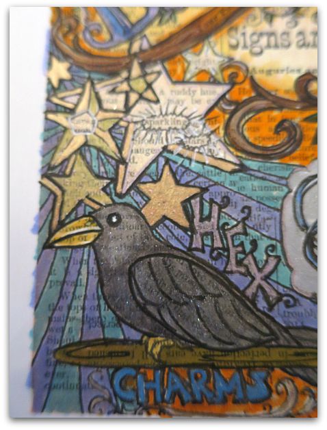
Spells 029

For this raven, I used grey marker, and the Wink marker in silver, outlined it again in black.  The beak is two layered yellows, with white highlights. The black,beady eye gets a double dot of white too.

(Notice that I'm not all that careful with my edges? Once the piece is done, I cut it out, that cleans the border up)
Spells 033

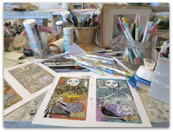
These are formatted to print out to fit into the journal I'm designing. One blank page, ready to color, will be in each kit.They will also be available as a digital download so that you can print out and color as many as you'd like.  You'll be able to find them in my Etsy shop.  
Spells 031

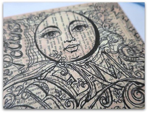
They start like this. I used pages from a 1930s fortune telling book to make the collage underneath the drawing.
Spells 006

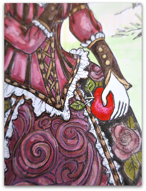
You can also find this Snow White coloring page in the Etsy shop too.
Spells 002

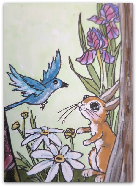
I colored this one the same way as the Spells page, using lotsa layers, and a mix of markers, metallic inks, opaque markers and pens, as well as a blending marker.  I've recently discovered those and really like them.
Spells 004

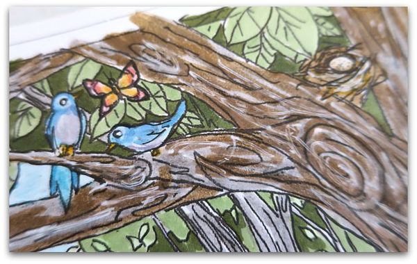
For this tree, I used gray distress marker, with brown over it, in most spots, then blended it and added white pen.

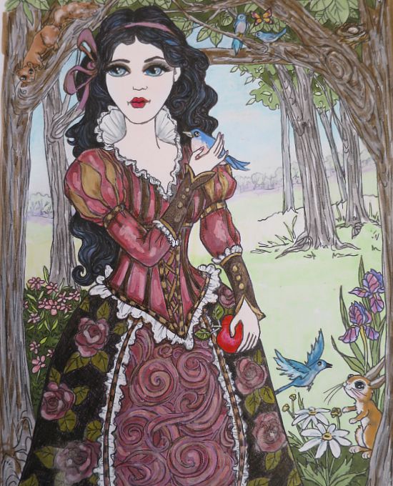
Notice that the trees behind it are just light gray? When doing a landscape, please keep in mind that the further away something is, the lighter it looks.
Spells 001

The trees along the horizon are done with very soft pastels, and the foreground is done in brighter colors.

I used the blending marker very heavily on the grass. With big areas, it is important to not have lots of scratchy looking marker lines.

Her eyemakeup is done with the Stella Wink marker, but I think I liked her better without it.

For the black hair, I first colored the waves in blue and purple, then layered with gray.  That way, it still has depth and isn't a flat color.

Spells 003

And you can still see the hand drawn lines that make up the waves.  The lace is light gray near the neck, with opaque white marker over it, then outlined in black again. The little bird is blue on top, pink on the bottom, white opaque marker over the pink and the line where the two colors meet. That opaque marker is a wonderful way to blend.
Spells 032

These tips are great for any coloring pages, or also for your own doodling or drawing project.
 

Spells 013s

 Remember, layer, layer, layer, for a more arty look.  
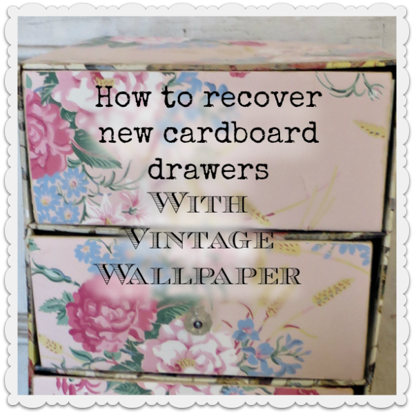
How to redo a cardboard chest with vintage wallpaper

antiques/junking, how-to projects, studio tour, vintage paper/collage art

Wallpaperdrawers 014

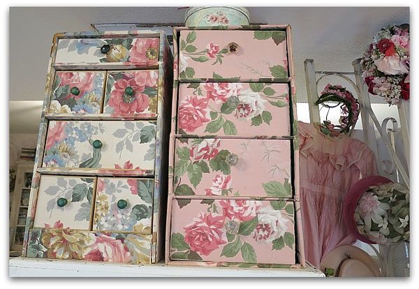
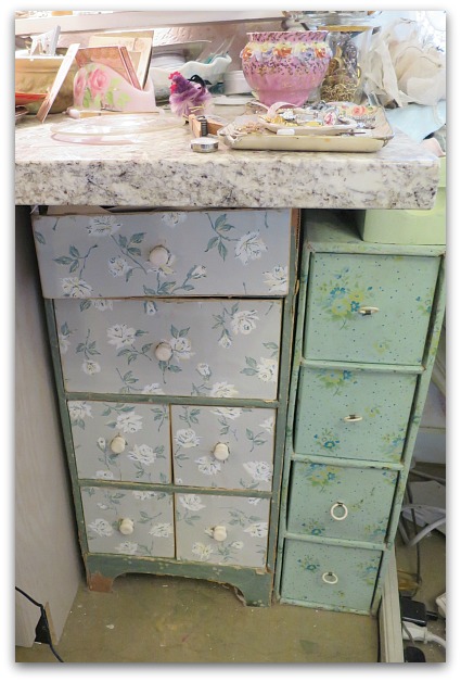
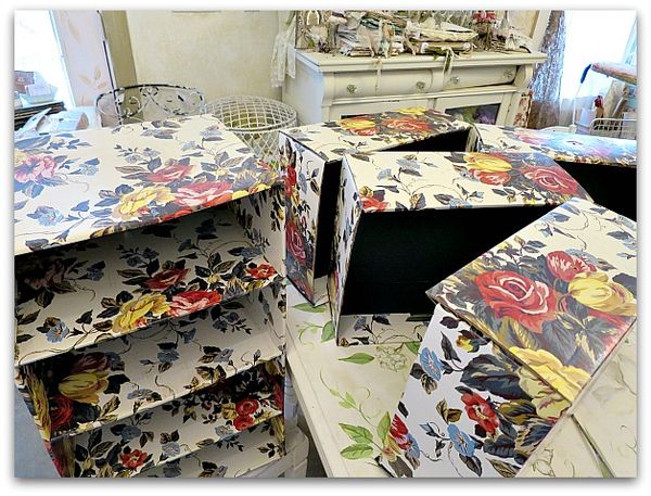
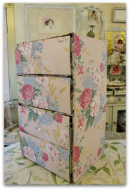
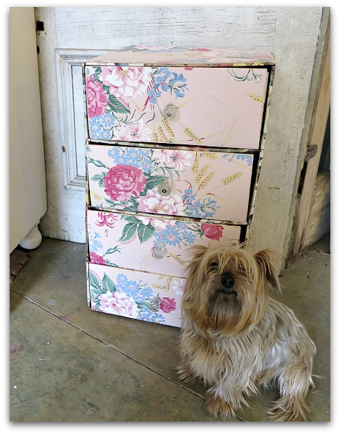
I've got a thing for old drawers covered in wallpaper and collect as many as I can for studio storage. But, they can be rare, or pricey.  So, when I find a newer set for cheap, I give it a makeover. Like the one on the right. The left one is an original, old chest of drawers, the pink one is a 50 cent piece I got at a garage sale and recovered myself.
Wallpaperdrawers 015

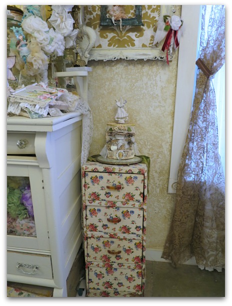
This one is old too, and it is covered in vinyl, not wallpaper like most are.

Wallpaperdrawers 017

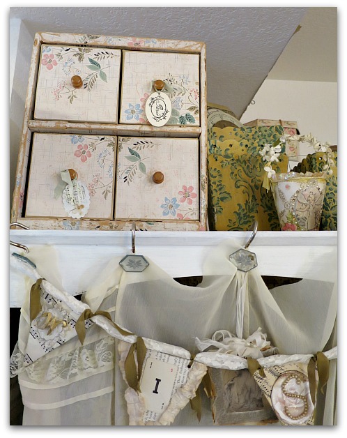
And I like this mini one too.

Wallpaperdrawers 016

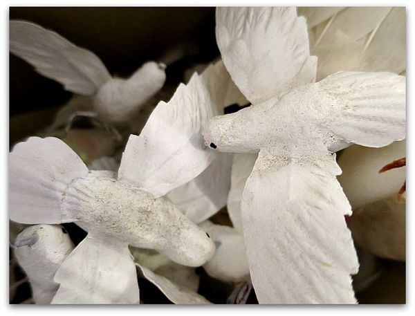
It is full of birds, eggs, and butterflies.  These whitewashed birdies were an estate sale find that Beth passed on to me.

Wallpaperdrawers 019

One thing I like about these, is that they can be tucked away into odd spots to create storage.  Or sat up on top of other pieces.  

Wallpaperdrawers 001

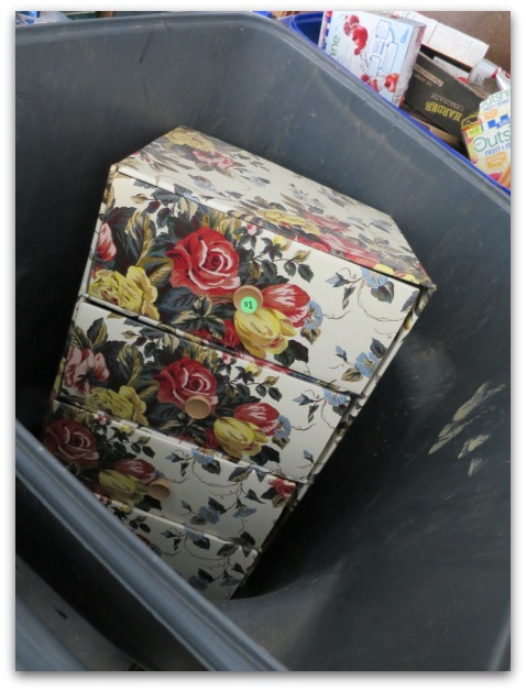
When I saw this tossed away in Beth's trash can, I had to rescue it. 

Drawer 002

Wallpaperdrawers 012

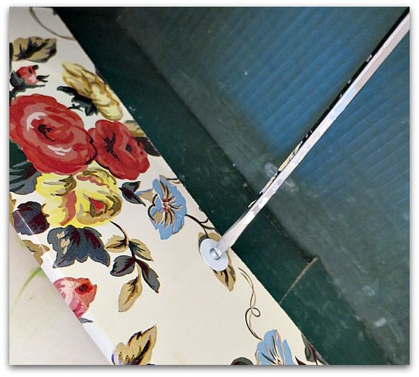
First step- remove the knobs. I had some glass ones to replace these plastic ones with. Which is what I also used on the previous set of drawers that I redid.  That is probably not an accurate thing to do, most of these little chests sport wooden knobs. 

But glass knobs are my fave and I stick them on anything I possibly can.  The ones I selected for this project are vintage, but I've seen some nice ones at Hobby Lobby that go on sale for 50% off an a regular basis.


Wallpaperdrawers 024

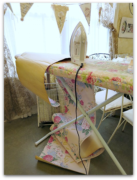
Second step- choose your paper. I have a few billion rolls of vintage wallpaper (a little addiction of mine), and knew this pink with roses would be ideal for these drawers.  But the roll was not only old, it was near its end, so tore very easily. A bit of ironing helped smooth it out so I could work with it.

Wallpaperdrawers 013

Too bad the existing pattern was sooooo 80s. And so shiny.  It is printed cardboard.

But that could be fixed.  I decided that since I was redoing this for myself, not to resale, that I would leave the interior as is.  If I was passing this along to a client, I'd have either painted or covered all of the shiny, printed cardboard design.

Wallpaperdrawers 020

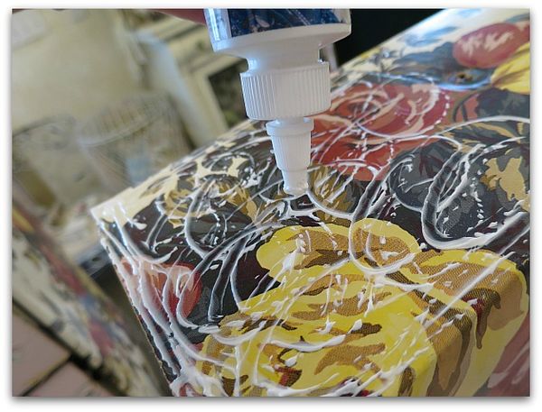
Using Crafter's Pick The Ultimate glue, I covered the front of a drawer, getting right up to the edges, then pressed the pink paper down into the glue.

Wallpaperdrawers 026

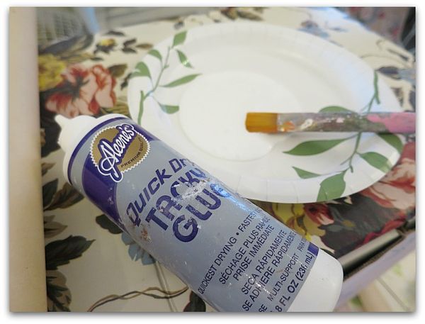
The sides were too big to try to do with a squeeze bottle, so I put a thinner glue on a plate and brushed it on.  I still used the Ultimate on the very edges, though.  They stick down better with a stronger glue. 


Wallpaperdrawers 021

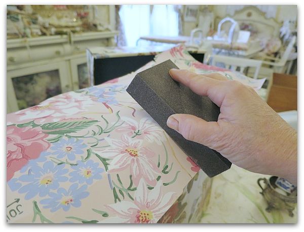
I don't precut or measure. I eyeball the paper to get a size that is close, glue it down, then I crease the excess paper and use a sanding block to "cut" the wallpaper to fit. No scissors.

Wallpaperdrawers 023

The sanding block should be used only in a downward motion away from the edge. It not only buffs and burnishes the paper's edge tightly to the surface, it cuts off the salvage.

Wallpaperdrawers 028

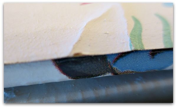
When possible, I lined up the side of the paper to the edge of the drawer.  Less waste of paper that way. But I still used the sanding block on it. The above photo shows why. The straight edge of the wallpaper is glued down, but doesn't look quite right.

Wallpaperdrawers 027

 A little buffing with the sanding block, and it looks much better.

I also discovered, that I could take the gloss off the printed cardboard on the bits like this between the drawers that didn't get covered in vintage paper.

Wallpaperdrawers 030

This is the side of a drawer, with the printed cardboard left as is and the vintage wallpaper adhered to the front. One tell tale sign that these cardboard sets are not vintage, is well, that they are cardboard and it shows. The really old ones are on wooden frames.  

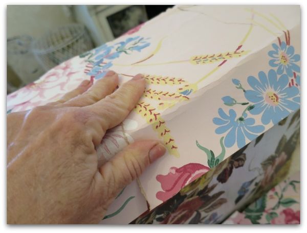
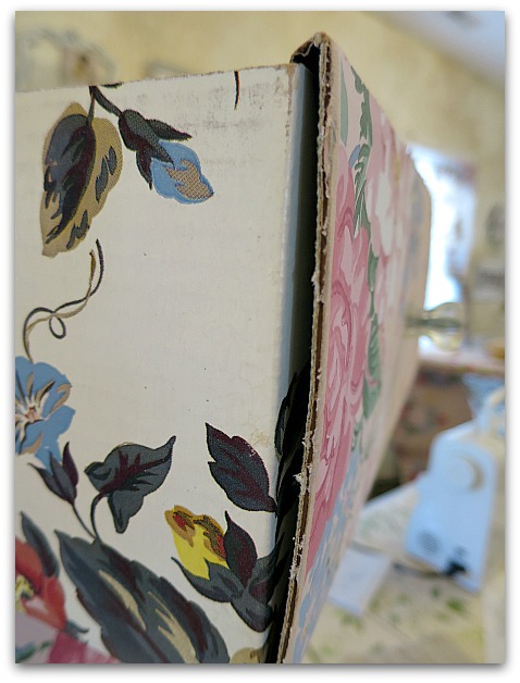
Now, I could have wrapped my paper around the sides like I did on the one in the very first photo on this post.

But I didn't.

 Lazy?

Hmm, maybe.

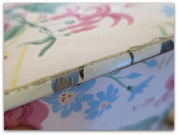
I squirted a lot of Ultimate glue into the crevice and weighted it down to dry, that lessened the gap and helped hide the fact that this was made of cardboard.

Wallpaperdrawers 029

I'm afraid that this picture doesn't show that last step. This is the picture that made me want to do that last step, though. Those gaps bothered me.

At first it bothered me that this was a little wonky, then I looked at the old ones I was using around the room. Well, wonky seems to be the natural state of most of them. 

Drawer 003


Dying silk ribbons

bird song art event, how-to projects, Tutorials

Dying silk 004

I wish every project involved silk or velvet ribbons…

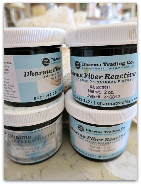
The Birdsong journal for my class needed velvet ribbons.  It is really hard to find affordable velvet ribbons anywhere!!!  I found them in white at Dharma Trading, and while there, fell for the silk too. And the dye, and some scarves to dye, and well, more than I should've bought.

Dying silk 007

I've been a fan of this dye for years and use it a lot, for many things (including bottle brush trees, wool roving, and tie dye).  

For ribbons, I didn't bother with instructions, or presoaks. These ribbons are meant for journals, not sewing on clothing that will  be washed. 

I've also used koolaide or food coloring to dye ribbon, and that works fine too. 

Dying silk 002

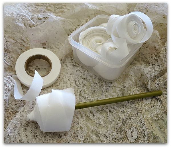
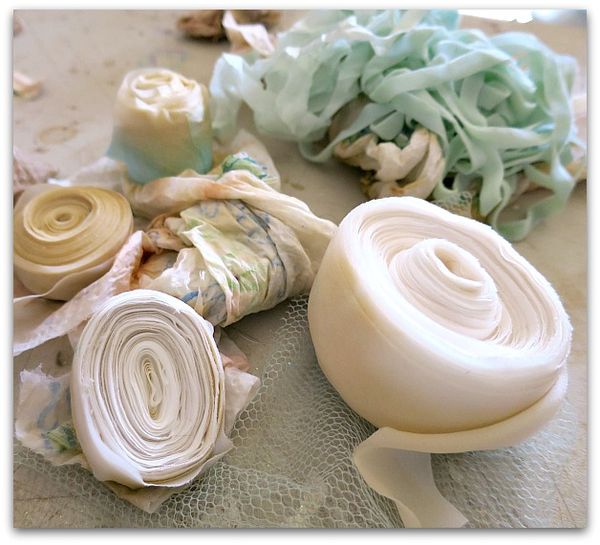
Since I bought the ribbon in bulk, but didn't want it all the same color, I had to remove it from the spool.  It needed to be re-rolled up to dip dye  (like I did crepe paper here).  A pencil worked great to roll it back up and I stored the rolls in a plastic tub so they wouldn't unroll again.

Dying silk 008

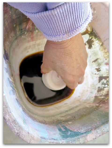
Each roll got dipped halfway into the dye.

Dying silk 010

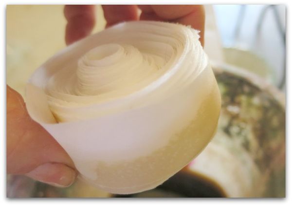
Some I used one color on and left the other half white.

Dying silk 005

Others, I flipped over and dyed the other half a second color.

Dying silk 019

These small bundles were left to drain on paper towels for a couple days.

The pile of ribbons in the back? Those are nicely crumpled instead of rolled, and were left all smooshed up to dry with that wrinkly effect.

Dying silk 016

For this, I just dunked a bunch of ribbon, and squeezed out the moisture, and left it to dry still scrunched up.

Dying silk 003

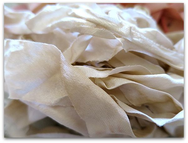
This is some ecru silk that was done that way. If you don't want the solid color ribbons crinkled, hang them up to dry instead.

More tips:

You should wear gloves.

If you want the dye to bleed, dip the rolls in water first.

Mix your dye in small batches, it doesn't take much.  And try the color very diluted first, it's easy to add more dye and re-dip the ribbon if the color is too pale. If it is too vivid, you can try dipping in clear water, or holding it under running water, but that might not take out enough of the color. Start light, work up to darker. You can dip a paper towel in the mix to see if you like the color, if you aren't happy with the shade, add more dye or more water before using the mixture for the ribbons or lace.

If you want a two color ribbon with white in the center, barely dip the edges in to the dye.  


Dying silk 001

While I had the colors mixed, I might have dyed a few more things too.  Newer white ribbon dipped in ecru dye sure looks nice and old afterwards.

Dying silk 015

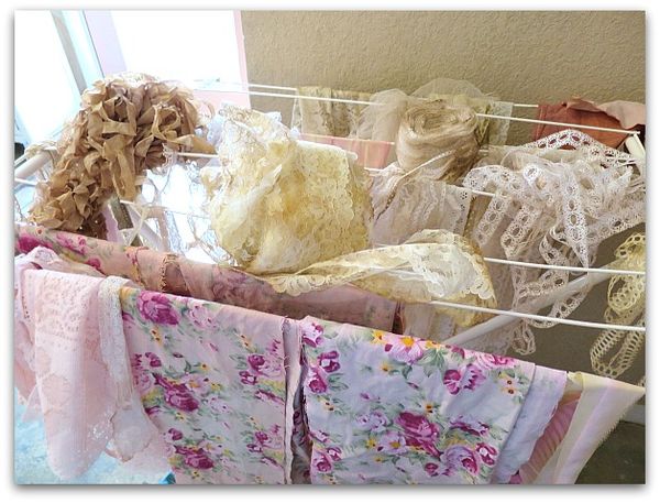
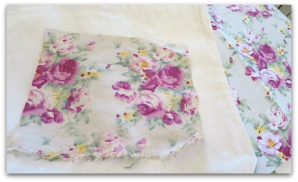
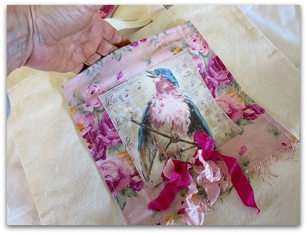
And this fabric was a bit too gray for my purpose. I'm sewing it to these canvas bags, but I wasn't happy with the original color (right) so I dyed some in pink, some in ecru.

Dying silk 014

Both did a good job of taking out the cool tones of the gray. I knew some dye would be the solution to the cloth not matching the bag. But the cloth was such a good deal, I couldn't turn it down. I found a bunch of it for a dollar at the Victorian Trading Outlet center, they use it on their ironing board covers. And I love the roses.

Dying silk 018

Especially topped with robins!


Aging a picture with crackle

Hand painted, Hand Painted Furniture, hand painted signs, how to's, how-to projects, paintings

1

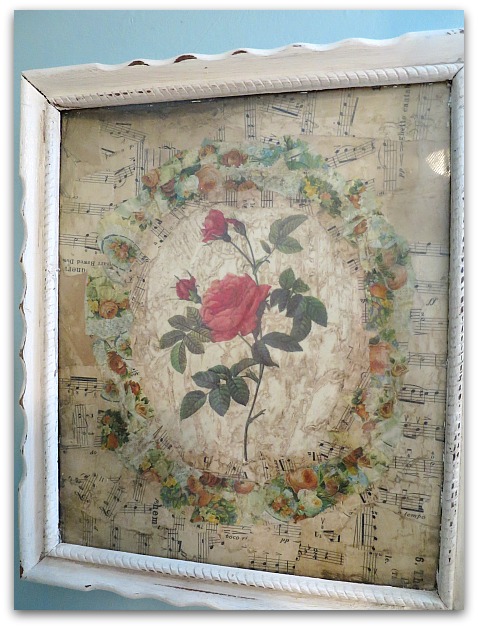
I was asked about this picture in my new guest room, so thought I'd give a quick how-to.

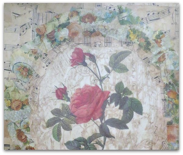
First, find a botanical, or other picture you like. Glue it to a canvas.

Next, tear and collage old papers around it. I chose a background of sheet music with an oval "frame" of roses torn out of old wrapping paper.   All are rough, torn edges, different shapes, and glued down with white school glue.

Pinkbathroom 004

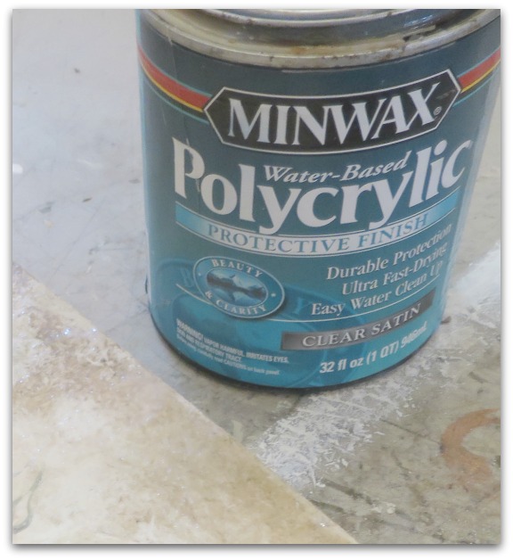
When dry, I clear coated it with water based Polycrylic from Minwax.

Pinkbathroom 003

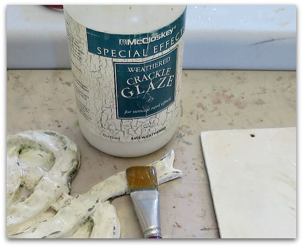
I let that dry, then brushed on a weathered crackle finish by McClosky.  

After that dried, another coat of Polycrylic went on.

The next day, I wiped on a sepia tinted glaze, let it settle into the cracks made by the weather crackle, and wiped it off. 

Cottageguestroom 016

Weathered crackle finish usually is applied over paint, then a second coat of paint is used over it to create a crackled paint finish. 

But, water based clear coat is much like paint without color, and creates the same effect.  But this way it is tone on tone, and clear. So, adding the sepia glaze shows off the crackle and ages any paper or canvas you do this over.

CrackleFinishCanvas2

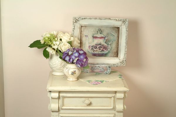
Here is a picture I used this technique on years ago for a Romantic Country article. The teapot is a photo copy of one of my original watercolors. 

For this one, I glazed over it after it was in a white frame, concentrating the sepia tone heavily in the corners, and also using it on the frame too.

Photo (4)

 I sincerely hate the look of crackle applied as it is supposed to be used, it is soooooooo fake. But I love it to use in aging a picture. And in aging other things too. The trick, to me, is to keep it tone on tone, to add texture.

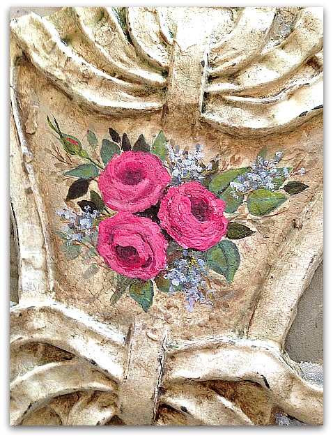
Here, I took an old piece of scrolly metal. It was antique, but it was not painted and I didn't want the paint I added to look too new. 

So, I painted the piece white, did the crackle, then a clear coat, then the glaze. Over that, I did the hand painted roses.

984271_10153011057194477_3476767174569364117_n

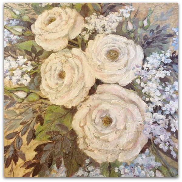
Same technique was used here on this canvas before painting roses.

Instant age for a brand new painting!

What to do when two connecting rooms don’t match?

cottage, how-to projects, redos

Cottageguestroom 001

Our newly redone guest room is two steps up from a little closet area that used to be a laundry room, years ago, before we moved the washer and dryer downstairs (best idea EVER) and before we carved this room out of the attic.

Previously, we redid the closet floor in a faux oak laminate. The upstairs of my house is all new, compared to the age of  the main house. We bought an 800 sq ft, old farmhouse, and added on, changed, redid, remodelled, and then added on some more. I adore the ancient wood floors downstairs, but for the guest rooms and kid's room upstairs, matching that gorgeous, old wood wasn't in the budget.  I was happy with slapping down some cheap laminate.  

And was very happy just to  have the carpet  gone.

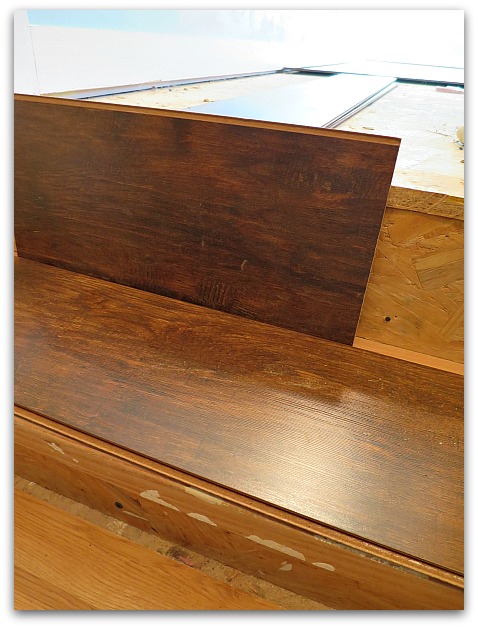
Anyway, when it was time to redo the guest room, I went with a dark, hickory laminate. I feel like it is much better to go the opposite of what is down in a connecting room than it is to try to  match it and be a hair off.  Since the first floor had been done years ago. I knew I couldn't do an even match. So, I went darker.

Cottageguestroom 002

We talked about covering the step in the hickory too. But, I didn't like the two floors butting right up against each other.

Cottageguestroom 004

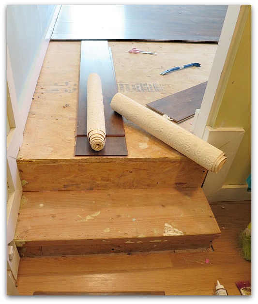
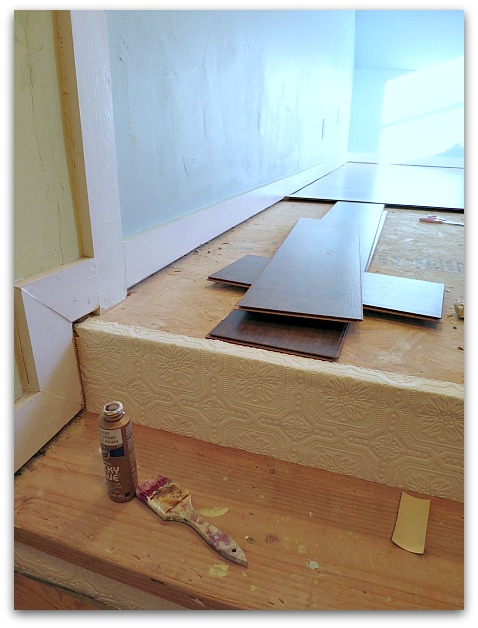
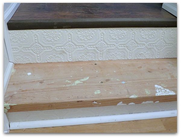
So, I covered the back of the steps, (is that called the risers?) with paintable, heavy duty wallpaper.  

Glued on tightly, not with just wallpaper paste, with real glue.

Cottageguestroom 026

Hmm, I reckon it would have been smart to have a photo of the finished project to show you, but this is as close as I have right now.  I could probably run upstairs and snap one pretty quickly…. but I think you get the idea from this?

I've painted the step and the wallpaper white to match the trim. (after caulking the areas that need it)

I think I'm going to like this solution!


How to make miniature book Christmas ornaments

holiday decor, how to's, how-to projects, vintage paper/collage art, We're having a party

Bookclub 054

As promised, here is the mini lesson on making mini book ornies.

Bookclub 027

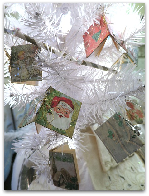
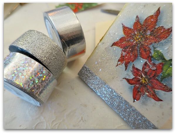
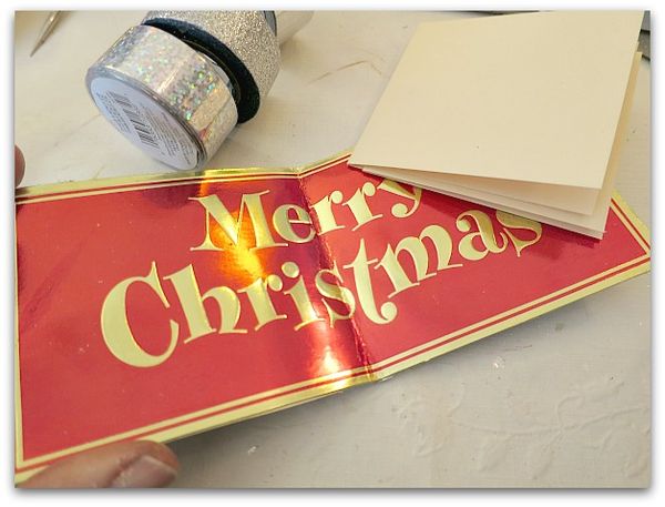
I used paper cut from vintage Christmas cards glued over chipboard for my covers, and card stock for the pages.  If your old holiday cards are sturdy enough, you could probably cut the covers directly from them and skip the whole gluing process.

Bookclub 032

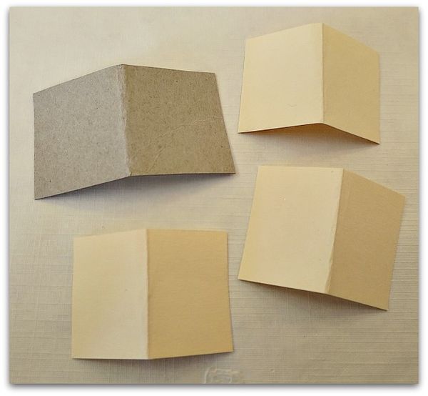
First step- cut out the cover material, fold in half.  Cut out three pieces of card stock slightly smaller than the cover, fold in half. (Any size you want to use works fine, most of mine are under 2", this one made from a card is larger)  

Glue decorative paper to the cover. The backside of mine was white, but if yours isn't, cover both sides.  This is a good time of year to save up chipboard,some pieces that I used were folded up inside a new shirt.  Stores often use it chipboard to hold the shape of folded garments. So, as you are opening gifts, don't forget to salvage the packaging materials!  (you could also cut up  a cereal box)

Add glitter, ink, etc, to your taste.  Don't add any 3D elements yet, though, embellish to your heart's content after the book is assembled.

Bookclub 031

To make the folded and decorated chipboard look like a real book, a piece of decorative tape, as faux binding can be pretty.

Bookclub 028

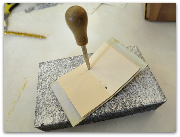
Put your three card stock pieces inside your cover, line them up, and punch two holes along the fold.

Bookclub 033

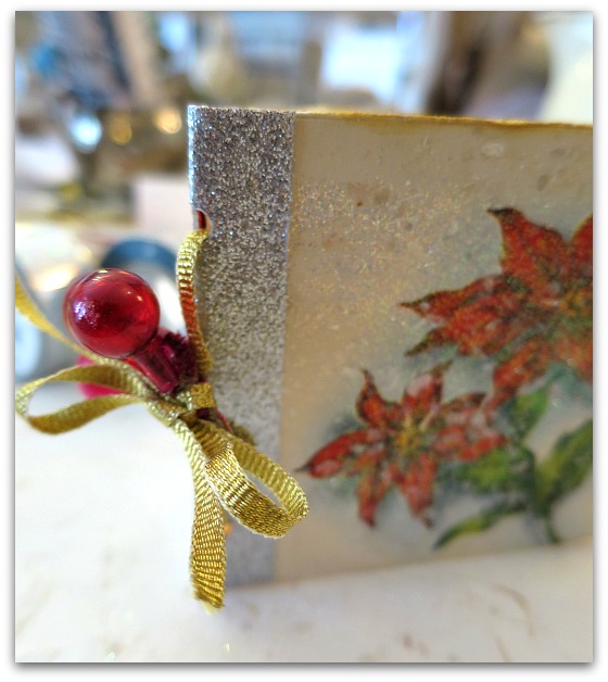
Tie the pages into the cover with whatever you think looks nice.  Here, I've used vintage ribbon.

Bookclub 030

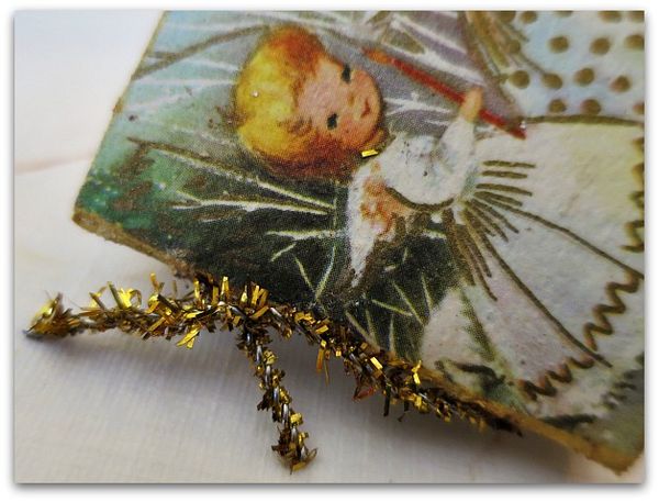
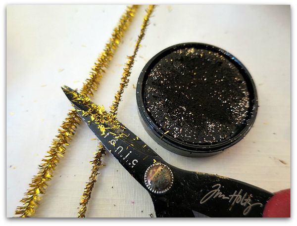
For a festive look, I like to use metallic pipe cleaners too.  But first, I vintage them up a bit.

Bookclub 029

Give them a haircut and rub the newly styled piece onto a brown ink pad for a tarnished finish.

Bookclub 078

Next, add a hook (to whatever you tied the book together with) and hang it up.

I used these as favors and to decorate with for my book club holiday party.  I think it would be fun to start a tradition of passing around a tiny book at Christmas dinner to have each person write a small message, or just sign their names.  Date it, and hang it on the tree each year.

If you'd like to make some bigger books in different styles, I have a tutorial available here.

Ornieparty 032

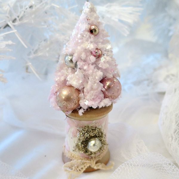
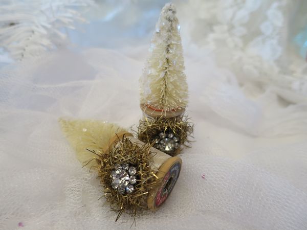
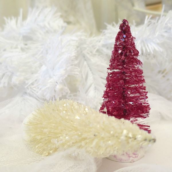
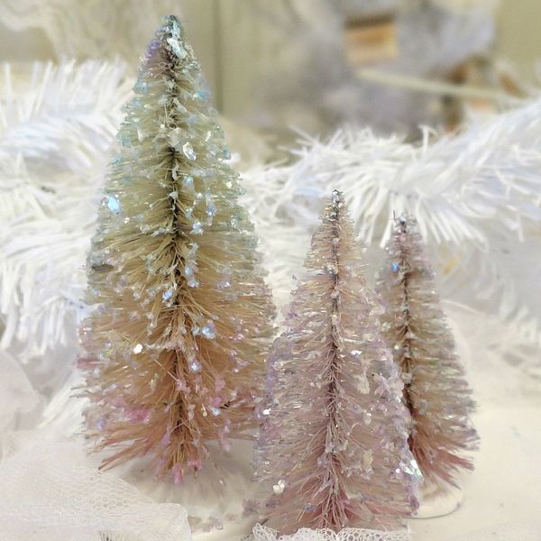
I'll leave you with some photos of what is new in the Etsy shop, it has been a busy Christmas tree season for me.  I just now got around to adding some decorated ones.

Ornieparty 039

Normally, I do get them out earlier…. But it has been quite a holiday season for me. Very fun, very busy!

Bfast santa 045

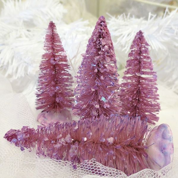
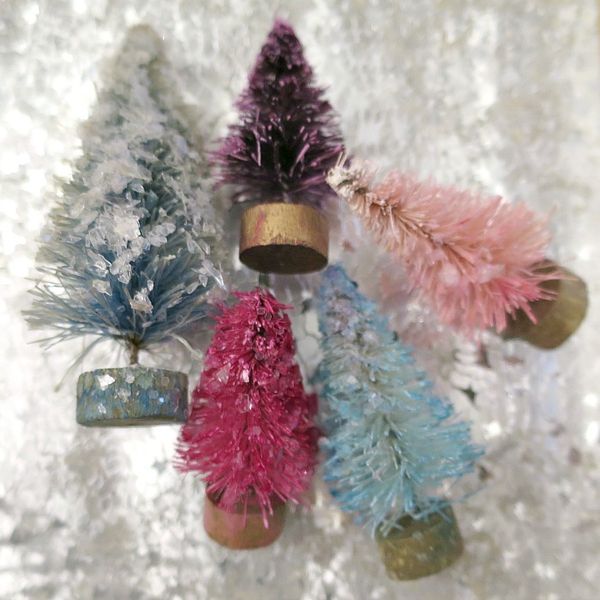
I have some extra bright trees this year, thanks to Sugarwings. She and I had a dying party the other day.  

Bfast santa 048

And we got creative with our colors.

Bfast santa 050

Bfast santa 052

Bfast santa 054


Making a package as special as the gift inside

holiday decor, how-to projects, vintage paper/collage art

Books 004

It's that time of year, when gifting is on our minds. Sometimes, the wrapping just about does me in.  One year, I did the smartest thing, I used ONE GIFT BAG for the whole family!! 

It really was a lifesaver that hectic year.  I made a pile of pressies for each person, in the room right next to the tree. Then, I took a large gift bag back there, put one present in it, and brought it out to be opened. Then I went back and refilled it, with something for the next person. It was funny, and we had a great time, with me playing Santa one bag at a time.

But if you are not rushed, and would like some special presentations, here is an idea.

Books 001

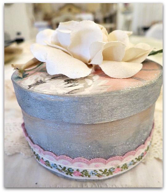
 I love these plain, wooden or paper mache boxes from Michael's and Hobby Lobby.  They are great to decorate and fill.  

One issue I have with them, though, is if you try to decoupage them, the lids don't always fit right.  I've learned that it best to paint the area under where the lip of the lid will fit on.   You can goober up the sides as much as you want, but stop your ornamentation right up to where the edge of the lid will be.

Books 002

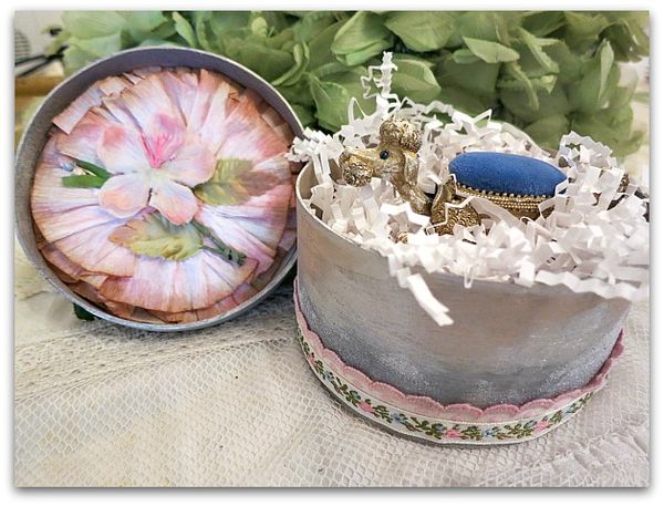
And don't forget to decorate the interior too. I usually paint the inside of the bottom part, and then do something unexpected inside the lid. (Do be careful not to have your embellishments get in the way of the lid closing, though)

Books 003

This whole thing was pretty quick and simple.  And nice to take the time on for wrapping notable gifts.  The majority of my giving will be done in paper bags, but I do like to whip up a few extra nice packages here and there.  The small boxes are only about a dollar each, and the decorations can be done with scraps, a little bit of paint, and glitter, plus an embellishment or two.    

Here are the steps I followed:

  1. Paint the inside, and outside of the box metallic silver.  
  2. Paint the outside rim of the lid also.  And the bottom of the box.
  3. Brush glue onto the top of the lid, adhere and burnish decorative paper (I used vintage wallpaper)
  4. Buff the edges of the paper with a sanding block to make it smooth. I then ran a metallic silver ink pad along the edge.
  5. Brush Elmer's glue along the bottom of the box, about half way up, and over the entire top of the lid, then sprinkle with crystal clear, fine glitter. I like Martha Stewart's glitter for this, it is very sheer.
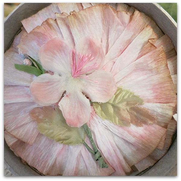
  6. When the lid dried, I drizzled glue on the inside of it, and laid two layers of ruffled wallpaper into the glue and added a flat millinery bloom to the center.   (You could use lace, or other ruffles, and a sparkling, old gem for the same effect)
  7. For the top of the lid, I simply added a millinery bloom from my garden of floral hats.  You can decorate the top as ornate or simple as you like.
  8. Run a bead of glue around the bottom of the box and press a ribbon or trim into it, cut to fit.  I added a second layer too.

How to make two ingredient Fluff Stuff

family, how-to projects, Sugarwings

Crowncenter 045

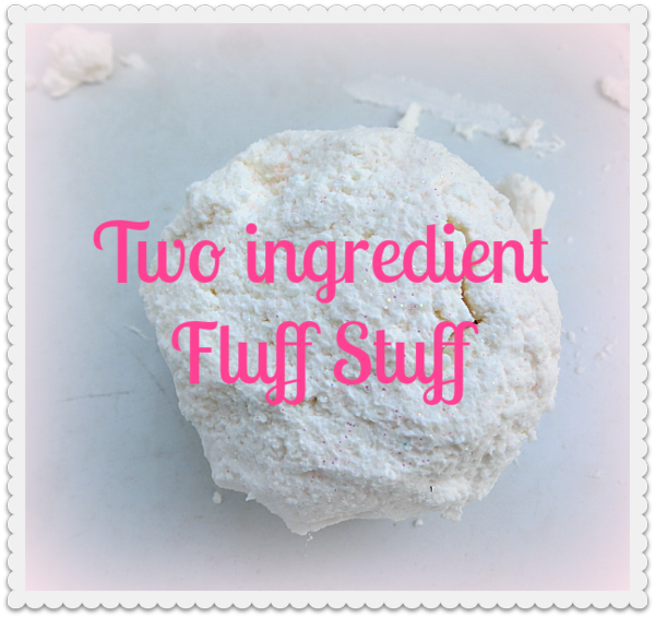
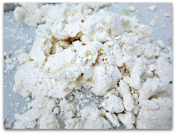
This is the easiest, cheapest, fluffiest stuff to make.  All you need is shaving cream and corn starch. 

Crowncenter 050

I buy both at Walmart, so the supplies are under $2.

Crowncenter 054

You will also need a bucket or bowl, and spoon.  Possibly glitter if you like sparkles.

Crowncenter 052

We LOVE sparkles, so dumped in a bunch of it.

Crowncenter 041

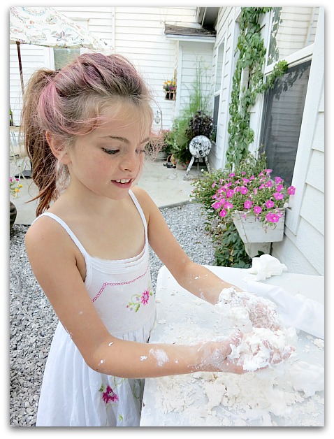
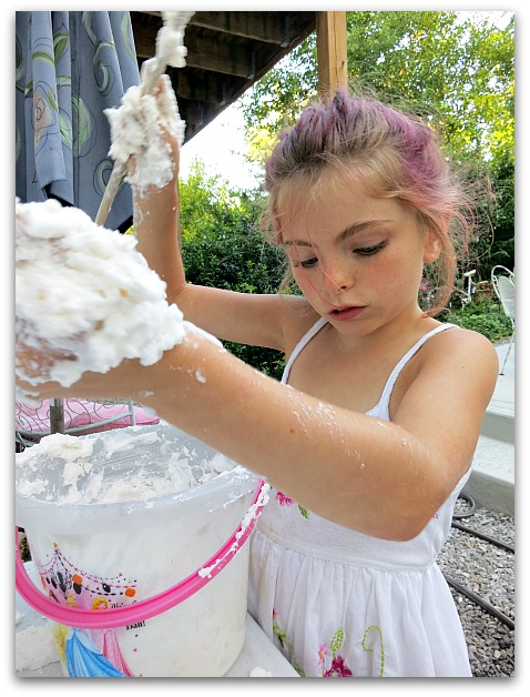
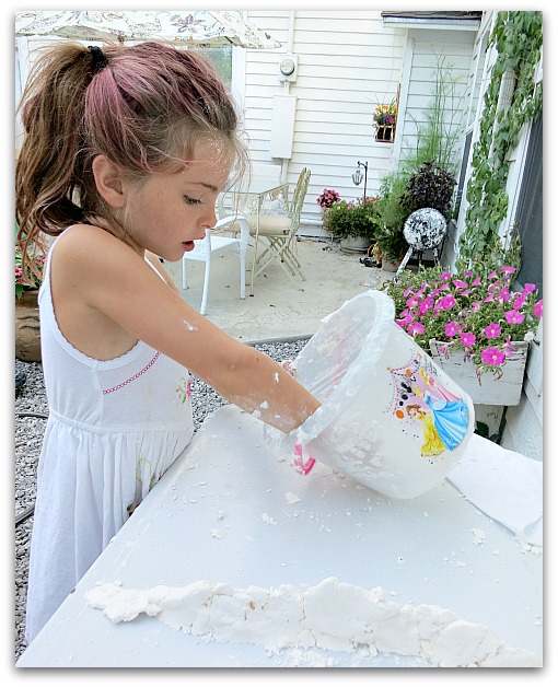
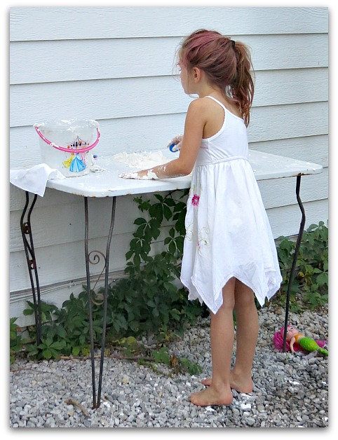
 I know I mentioned a spoon, but we found that it was more fun to mix with fingers.

Crowncenter 044

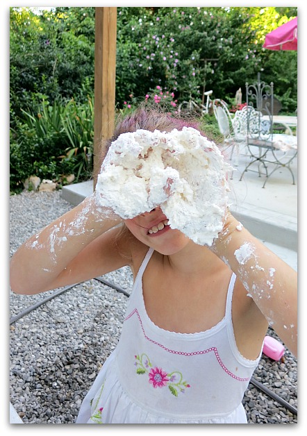
I didn't say that it was  more tidy to use fingers…

Crowncenter 042

Here is how we did it: 

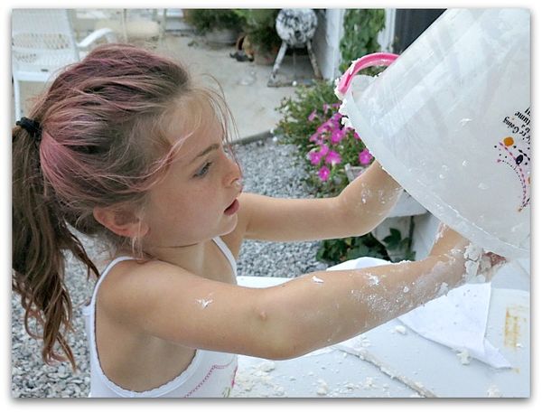
We randomly added shaving cream and cornstarch as we played with it, then dumped in glitter.

Crowncenter 062

Here is how you should do it:

Spray out a giant pile of shaving cream, reserving some in the can in case you need it.

Slowly add and mix in cornstarch  till you get it to a good consistency.  (about 1/2 to 3/4 box)

Add more shaving cream if needed.

Add glitter, if wanted.  (You'll be glad you did)

Crowncenter 060

I'd say you could add some food coloring if you 'd like. But we were going for summertime snow, and singing about Olaf as we made ours.

Crowncenter 064

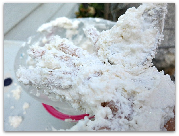
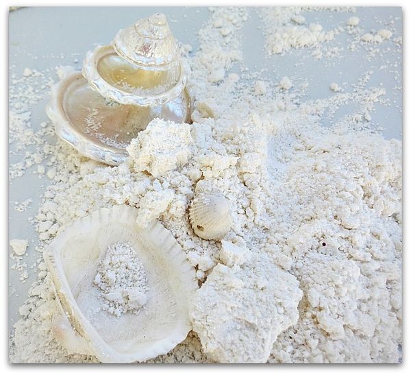
Sugarwings added some shells to play with after she was done pretending it was snow.  This is how it looked after leaving it outside on the table overnight, uncovered.  I'd say it would probably be easily saved in a plastic bowl and reused if wanted. But for us, the fun is in the making, so we'll spend another $2 and make some more next time. 

Securedownload (1)

Our Summer Of Fun has been going by much too fast.  

Securedownload (5)

But we are enjoying every minute of it.

Crowncenter 066


Taking time off to be with the girls, doing craft projects, day trips, swimming, and just sitting on the porch telling stories has been good for my soul.


Securedownload

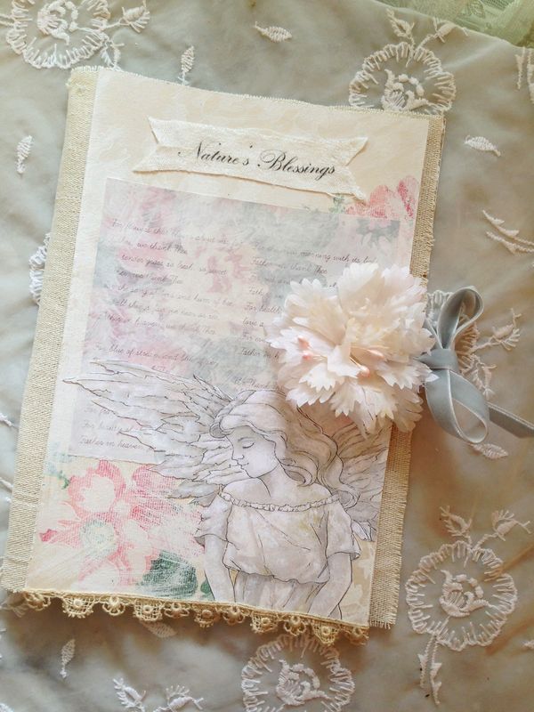
Probably not so good for business… but I have made time to create and am looking forward to the "Journal of Nature's Blessings" swap. (this photo is from my prototype). And I want to thank everyone who helped me de-clutter the Boutique with the purchases made during the 50% off sale! I went from 10 pages of inventory to 6.

 Now, time to rebuild with new goodies.

Securedownload (7)

But not quite yet, I'm going to soak up some more summer fun first!


Jswapbuttonsmall


Interested in the journal swap?  Info here.


How to make fizzy bath bombs

how-to projects, Sugarwings

B

In our ongoing quest for the crafty-est summer ever, we decided to make some fizzy bath bombs.  First of all, those things are way cool. Second, they can be pricey for something that dissolves that fast.  It was a bit cheaper (and more fun) to make our own.

Bath bombs 013

I looked around at various sets of directions and recipes online. Then kind of consolidated and made up my own.

Here is what we used:

1 cup baking soda

1/2 cup citric acid (I found it in the canning section at Walmart, $3 for this little jar, I bought two jars which is enough to make about 3 batches and have a little bit left over to sprinkle on sliced apples for a picnic)

1/2 cup corn starch

2 tablespoons salt

3 tablespoons coconut oil (sofftened, not melted or hard)

about 8 tablespoons liquid (we used water)

few drops of scented oil (we had lavender)

Bath bombs 030

The salt that I bought was the wrong kind, but I had some of this in the cabinet, which worked pretty good.  I'd purchased ice cream salt, that was too chunky to use.  Epsom salt would probably be fine too.

Bath bombs 019

You can use food coloring, if desired.

Oh and glitter! Ours was in a magic wand shaker that Aunt Sissy gave to us. 

Bath bombs 020
First you mix all the dry ingredients, then add the oil and the essential oil drops.

Bath bombs 012

Stir well.  Then mix the food coloring and water together in a squirt gun.  I saw that Martha Stewart used a mister/sprayer thingy in her directions, but we didn't have one of those.

Bath bombs 026
Start adding the colored liquid a squirt at a time.

The citric acid has a reaction to the baking soda when you drop the bomb in the tub, that is what makes the fizziness.  It's also what you want to prevent from happening when you are making them.  Save the fizz for the tub, not the mixing bowl!

The trick is to have one person add the liquid while the other stirs non stop.  A bit of fizz breaks out with every squirt, but whip it in fast and it goes away.

Mix and mix while adding spritzes of water until you get the consistency that will hold when you squeeze it into a ball.

Bath bombs 027

Next, press it into molds. 

Bath bombs 029

We used the bottom of a measuring cup to press the mixture down hard, and get it compacted.  Next, you wait a day or two till it sets up.

We scraped up all of our crumbs, and all the remnants in the bottom of the bowl and on the spoon, then added some water to see if it would bubble up, because we couldn't wait that long. And yep, it was as fizzy as an alka seltzer!

The food coloring and the glitter make the bath water pretty. But everyone might not enjoy that as much as we do.  You can always leave that stuff out.  

Securedownload (1)

We got about 6 large hearts and 6 smaller tartlet shapes out of our batch.


Jswapbuttonsmall


Interested in the journal swap?  Info here.


Scroll to Top