paintings

How to paint cabinets with NO PAINT and NO SANDING at all, and some Venetian Plaster tricks

cottage, how to's, Kitchen remodel, paintings

IMG_4867

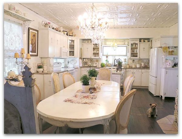
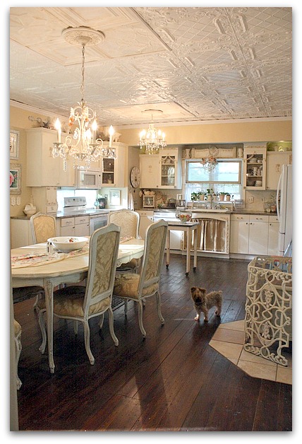
I've been redoing my kitchen recently. Here is a before photo, which isn't bad. But- this was a couple years ago and there has been some wear that required touch ups.  The swags on the glass cabinet fronts had been knocked off, and those two cabinets had to be sanded down after taking off the cracked remnants of the trim.  I no longer had the same paint color, plus, those cabinets hadn't been repainted in a long, long time.

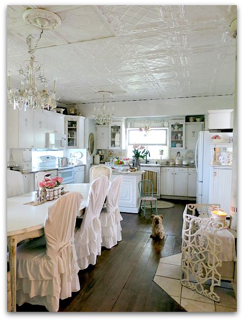
I've been jonesing for an all white look.  (hmm, does that term age me?  "Jonesing" might be something we said back in the 70s) For years, I've loved that look, but have never had it in my own house.  I tend to go cream, tan, or ivory when I decorate. But I've been drawn to photos of pure white rooms and always wanted one of my own.
Kitchen plaster 020

And I got it!

Kinda.

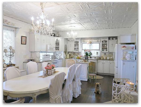
 And I really, really do love it. I kept quite a bit of the ivories and creams, because I still love them, and like the mix. But the overall effect of the room is pure white. Especially in photos.  In real life, you can see more of the textures and tones, and the room feels a bit warmer than the pictures show. 

But still white.
Kitchen plaster 027

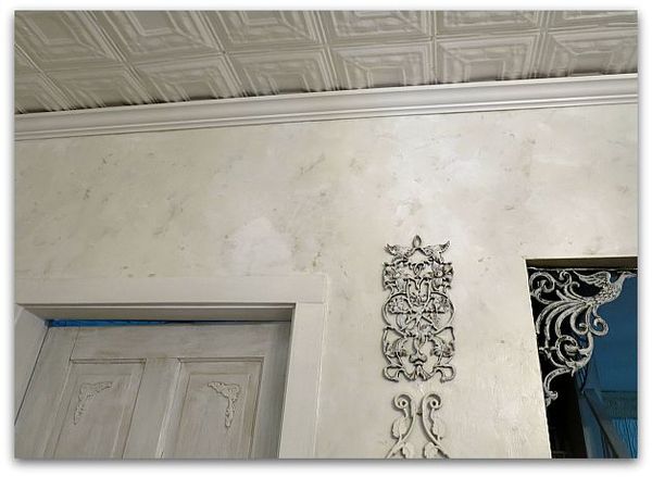
To pull off white without the room looking stark, I felt like textures were important. The ceiling is already quite texturey from the vintage ceiling tiles, and the doors are dry brushed with 4-5 different whites and creams. (Which happened at first by me touching up paint every year or so, and dry brushing over smudges and finger marks with a different paint that was already on the door. I liked it so much, I just dry brush various whites onto it when I repaint periodically- a happy accident that turned into an "I meant to do that" situation.

And for the walls, I used Venetian Plaster by Behr instead of just paint.  
Kitchen plaster 001

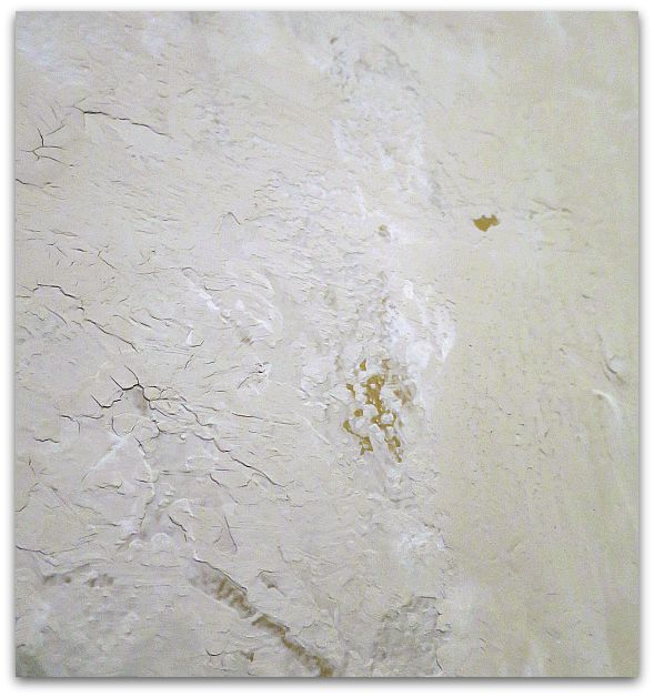
The walls were already kind of a tan, which made a good background color that I let peek through in some spots.  But the plaster color chart didn't sport any choices that I liked, it was pretty limited. So, I went  with plain, untinted, as is, plaster straight out of the can.
Kitchen plaster 004

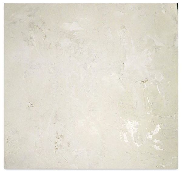
Trouble is, it was a tad bit gray, not as bright as I wanted.  I fixed that by using Behr pure white paint along with it.

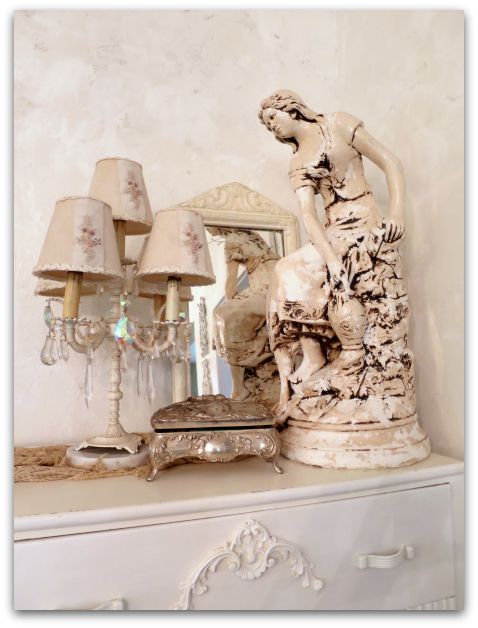
I scooped out about two cups of plaster into a paint tray, and poured approximately 3/4 cup of white paint over it.  Next, I took a 6" wide, plastic dry wall or putty knife thing and troweled the mixture onto the wall. It mixed as I troweled, with some areas more white, some more gray, some both.
Kitchen plaster 031

This is NOT what the directions say to do.

But it worked for me.  I went around the room 3 times, doing this.  I also didn't let it dry as long as the directions said, or hold my trowel at the same angle that was suggested.  I didn't burnish it either.

I held the blade pretty flat against the wall each time, the coats I made were thinner, which is probably why I needed three instead of the recommended two. (If I could do much math, I'd tell you the angle)

It was looking like there were tracks in it from the edges of the knife, so I took my red handled Tim Holtz scissors that I love so much, and that will cut through everything, and trimmed the edges of the blade to a curved shape.
  Kitchen plaster 028

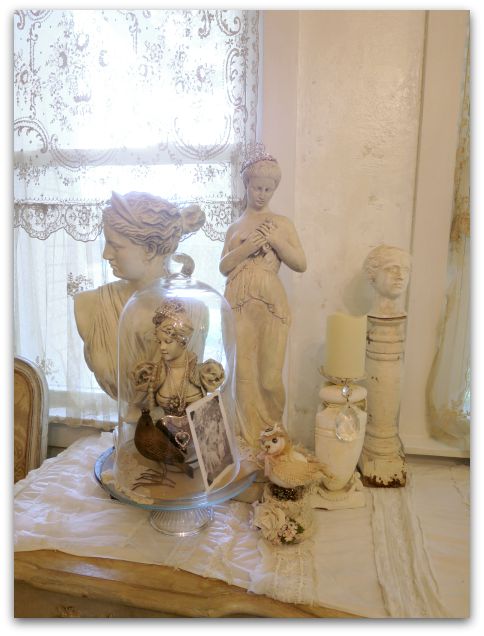
Over the top, I put three coats of Minwax Polycrylic clear coat (water based- satin). I used three because I like the depth that gives the plaster.  I was hoping for a marble-y effect.  

I think that the layers of subtle colors on the wall give the room the light, bright, white feel I was hoping for, but still blend well with my ivory curtains and whatnots around the room.
Kitchen plaster 006

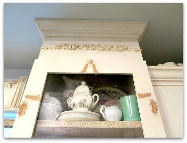
After the 3 top coats on the wall, I started in on the cabinets. The broken swag embellishments had to be pried off, then the wood sanded down.
Kitchen plaster 009

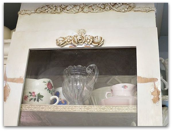
I salvaged the roses from the center of two of the swags to glue to the top of the glass.  
Kitchen plaster 012

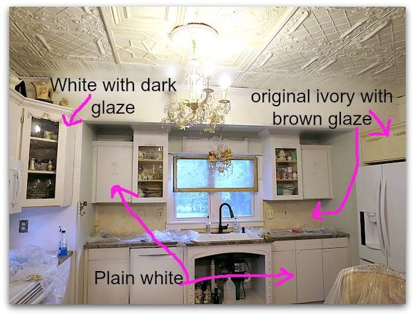
Here is an in progress picture.  Some of the cabinets painted white, some stained, some as is.

Next, I painted them with bonding primer.  I didn't want to sand the existing paint, and if you use a primer that says "will adhere to glossy surfaces" or "bonding" you don't need to sand.  Even over oil based paint, like I had used on the cabinets originally.  Very much like in this tutorial, but with a brush, not a spray can. Kind of like we primed cabinets in this post.

It took two coats of primer to get a good cover.  I used one of those small rollers meant for smooth surfaces.

I sincerely loved the white, white, white look of the primer.  BUT- I knew that I couldn't live with that level of cleanliness, too many people worked in my kitchen, too many big meals were prepared there.  Too many splashes down the fronts of the cabinets. Now, I'm not saying I'm a pig, I do wipe the doors off regularly, but not every ten minutes.

So, I decided to add a dark glaze.  If done right, it wouldn't take away from the whiteness, it would just accentuate the rose embellishments and help hide smears that happen as we work in the room.
Kitchen plaster 010

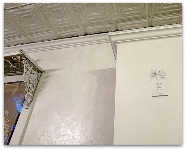
This picture is of a primed door.

Since I decided to use a glaze and a  water based clear coat, I decided that I didn't need to do the painting step.

You CANNOT use primer alone and leave it! It is meant to be used under paint. But- glaze is a form of paint, and water based clear coats really aren't that different either. 
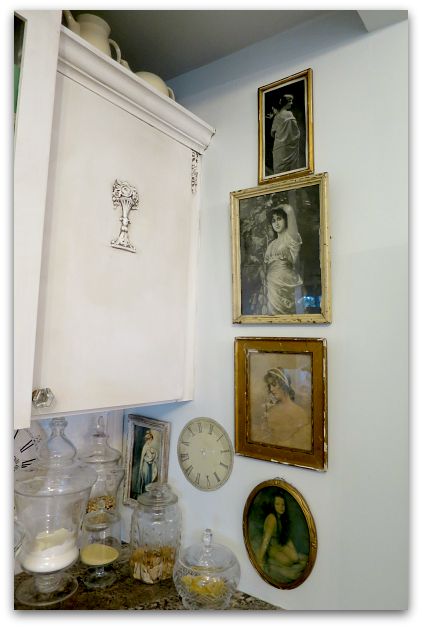
Cabinet 004

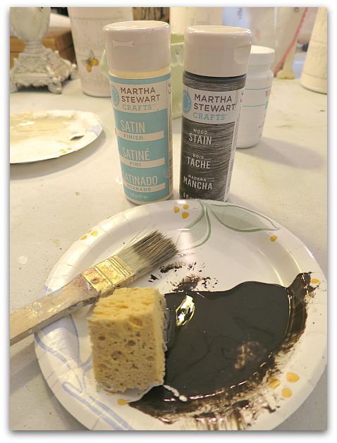
But then, instead of tinted glaze, I kind of experimented and used Martha Stewart wood stain (water based) because it was on clearance at Michaels and because I liked the dark, dark walnut color of it. I thought that it would look great with the granite countertops, and could be used directly from the bottle, no mixing like I'd have to do with glaze and paint. 
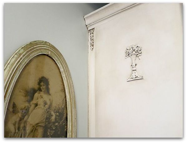
Cabinet 003

I discovered that glaze might be easier, the wood stain had a learning curve.  The trick is to work in very small areas at a time.

First, I brushed the deep color into the embellishments, and wiped it off with a damp rag. Then I buffed it with a dry rag.   After that, I ran a brush full of color all the way around the edges of the door, and blended it with the wet, then the dry, soft rags again, working the color from the outside toward the inside.

If I got it too heavy, or if it dried too quickly for me to get the blended look that I wanted, I found that a wet, Magic Eraser was perfect for lightening up any mistakes!

The crown molding was simple, brush color onto a couple feet, wipe, and keep going.
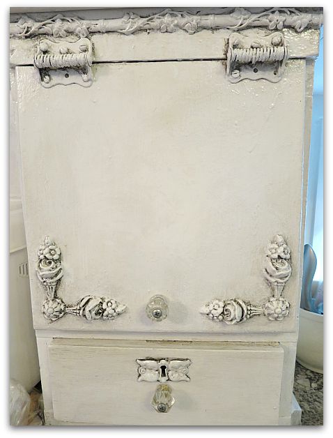
Cabinet 002

These new tones actually match my countertops much better than what I originally had used. Because I'd painted the ivory oil based paint and a coffee with cream color glaze onto the cabinets to match a granite sample that I'd picked out when the kitchen was first remodeled. 

Then, the granite was cut wrong! And we had to pick another similar piece, which wasn't nearly as golden as what I'd first had.

So, for years, I kept thinking I'd redo the paint job, and am just now doing it. And I am so pleased that I did.
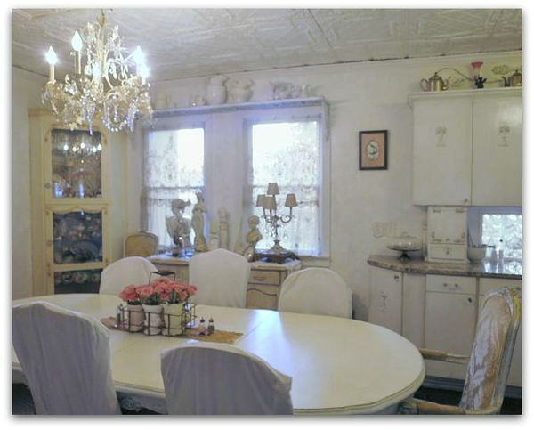
Kitchen plaster 026

For now, I've left the corner cabinet as it was.

Let's not say that 3 solid days of troweling on plaster, climbing up and down ladders, and twisting around to get into the corners of the cabinets along the ceiling, were too much for an old broad and I was too tired to tackle one more cabinet.

Let's just say that the contrast is nice, and that it kind of ties the mixes of whites together, ok?
Kitchen plaster 016

I used a semi gloss clear coat on the finished cabinets for durability. If I didn't have such a high traffic kitchen, I'd have gone with satin, because I like that better. But I'd rather it repelled messes. The higher the gloss the more durable a surface is. 
Kitchen plaster 029

I've always said that with neutral tones in the basics of a room, you can change the look with just a few accessories. I think this will be even more true with these clear whites.  And I do like changes. This room can stay white on white, or with a few red accents can have a totally different look for the holidays, still keeping that romantic, serene feeling that I wanted. 

Yep, I think I'm loving this!
 

Coloring Pages for adults, fairy tales and birds

drawing, Etsy Goodies, Hand painted, paintings

Sss 002

I've been hearing a lot about coloring pages for adults lately.  And last week, in the Parade magazine was this article about them.

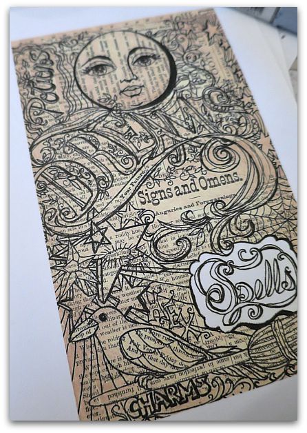
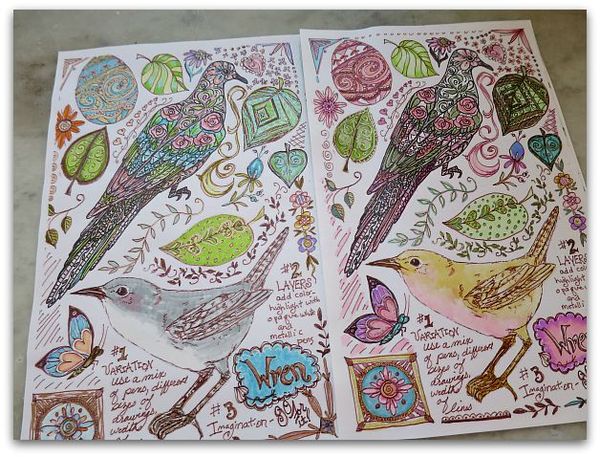
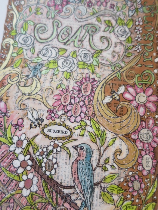
Over the last few years, I've been doing what I call "doodle pages" and including them with journal classes and swaps.   Most of mine are done over collaged, vintage text pages, and some are actual pages of tips and how to's on how to make your own. I still have a couple of those kits left here. I also have that info and the pages to download in my online, "Creating an Art Journal" class.

Cp 001

When I was working on these pages for my Birdsong 5 kits, I was enamoured with coloring and had to stop myself from staying at the kitchen table and coloring one page after another, over and over again. I told myself that I was making "examples" for the class…

Yea, right.

I was hooked on the markers and ink.  I was an avid color-er as a kid and apparently, that is not something that you outgrow.

Cp 004

I figure I can't be the only one, and have heard friends talking about coloring pages, listened to a story on NPR about it, then when I saw it in Parade, I knew it was as addictive and fun for others as it is for me.

So, I've added a pair of the collage background, bird themed pages to Etsy.

Enchanted Affaire

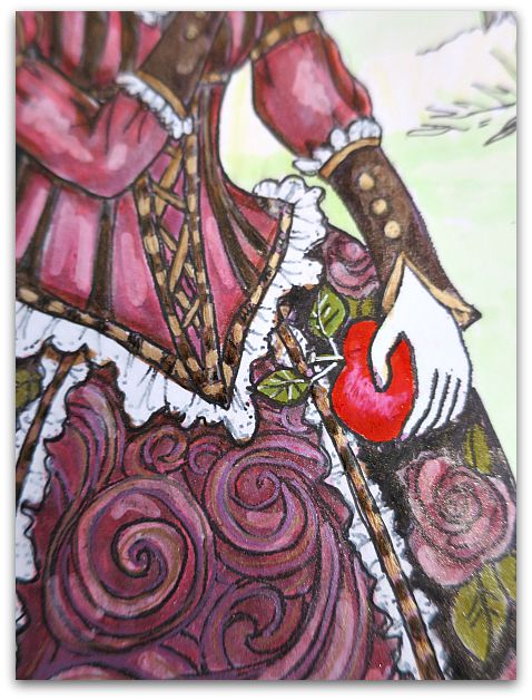
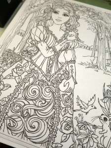
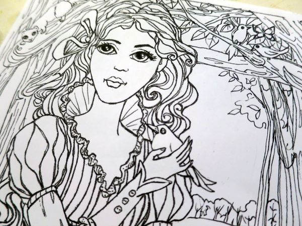
And I reworked the sketch for this painting to make it "coloring friendly".   Which involved printing the sketch, and removing all the shading, redrawing the black outlines sharper, and using white ink to cover up some areas, then scanning it again, printing it over, and doing that same process again, until all of my lines were the way I wanted them to be and were easy to follow for anyone to fill in.  

I probably should have just started over from scratch instead of spending so much time redoing this page, but this picture of Snow White has a special place in my heart.  And honestly, I wanted to color one myself….

Cp 006

So far, I haven't had a chance to do that.  Things have been busy around the cottage.  Just a typical stuff, like a roof caving in at my son's house, and all of his belongings covered in black mold spores, so that he had to move out and move here temporarily.  It has been rough on his family, but I'm glad that we have plenty of space for them here while they are unsettled and have no roof.

And lucky too, that we have an extra garage that we don't need to park in for summertime so they can store their stuff in it, as well as a big yard to spread out a tarp and let all of their belongings bleach in the sunshine.  They spritzed it all with vinegar and let the sun cure the mold spores.  And are now waiting to see if the landlord will release them from their lease.   

Dewdrop is coming back this week, and Sugarwings was very worried that she would be upset when she heard about what happened to her bedroom.  It was sweet of her to think of her sister's reaction.

 On the other hand, it was a bit selfish of me to be thinking, "Oh goody, we get all the little girls here, living with us again!!"

But back to coloring…if you like coloring too, I have two fairy tale themed coloring sheets available as well as the birdie ones-  right here.  Each pair is $3, and a digital download that you  save to your computer and can print out at 5×7" or 8×10" as many times as you'd like. 

If you are anything like me, you'll be printing out multiples and coloring them over and over again, because you never get the same result twice, and it is a relaxing, creative little hobby.

I hope to have more added in the next few weeks. These are fun to make, as well as to color!

Following Links

paintings

Securedownload

Hope helped me clean up my side bar recently. I asked her about adding some little buttons in a block that held all of my "follow me" links instead of having the long row of ugly connections that were on there at the time.

She suggested that I draw them instead of using the official symbols. Thanks for the good idea, Hope!

Type

After Hope got them on the side bar, she thought the text was a little too small, and we should change the box to hold two buttons across a row instead of three. But that would make the box uneven, so I decided to add a Typepad follow button for symmetry.

Which is a good thing to have anyway, I just never added one before.

So…. if you aren't a follower, it's pretty easy to become one now. Just click on your preferred venue and sign up!

And if you are already a follower, thank you.


If you are wondering why I slurp and spit when I talk…. and some thoughts on aging

Dew Drop, family, paintings

Toothlesss

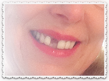
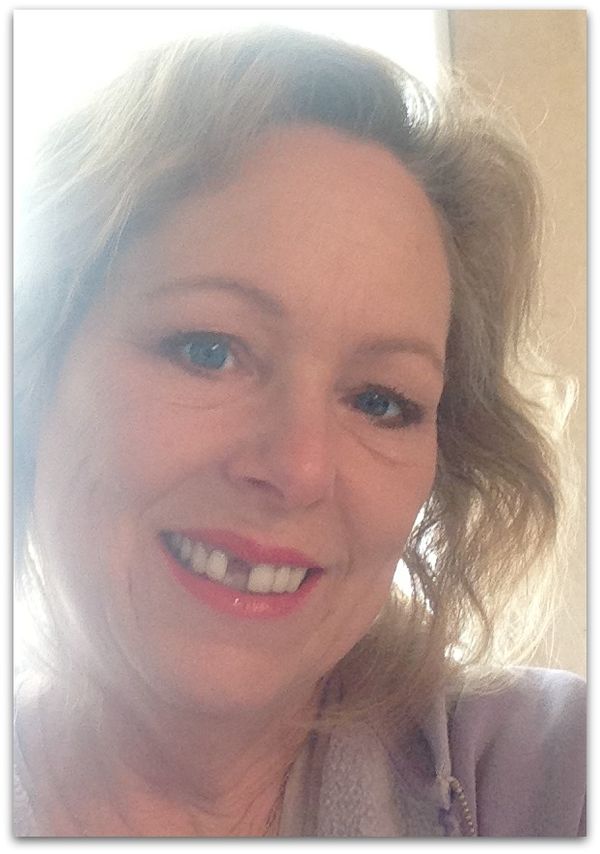
Yep, this is me right now. 

Ouch!

And Uck!

A while back, I carelessly jumped up on a stool to get something out of a cabinet (without realizing the door had been left open) and whacked myself in the face. I had a bloody nose, black eye, but my mouth looked fine, even though that is where it hurt the most.

Then, one day, weeks after the incident, I took a bite of a popsicle.  And my front tooth flew out of my mouth, bounced off a door, and ricocheted across the room. Apparently, I'd damaged the root when I smacked my face into the cabinet door, and the tooth was just waiting for a reason to fling itself of my mouth.  

Yardwork 006

My dentist gave me a temp that was my own tooth glued to something that looks like a bleach tray, which I had to take out if I wanted to eat. Then, he had this temporary partial made, which I was quite happy with even though I don't talk, or eat well with it.  I've been practicing saying "Five, fat fairies in the food forest sat sipping cider slushies."

 My "f"s have gotten a little better, but my "s"s still sound slurpy.  

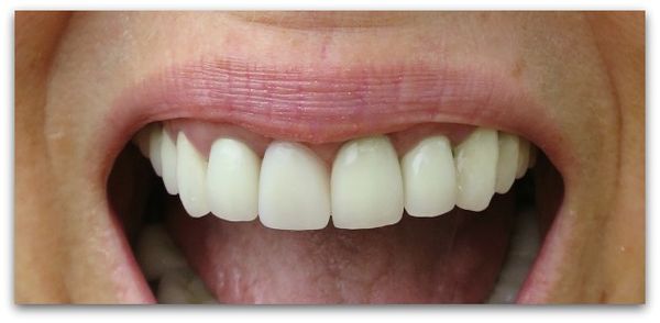
Since then, I've had some reconstructive surgery, and hopefully will have the two front teeth redone this summer.  Somehow, messing with one, messes with the other front tooth too. Sadly, I had just gone through major repairs on these two teeth and surrounding gums a year ago.  And now am paying for the same two teeth to be redone again. And the specialist has warned me that I won't get the same look, that  it can't look as natural as before.

Photo (2)

 I keep telling myself that I am extremely lucky to have good dental insurance, and money to pay the deductible. That while this is unpleasant, much worse things could happen, and if it doesn't look as good as before, at least I don't have to be without a tooth forever. Since I've lost my own tooth, I've noticed other people without teeth, and I have a feeling that they might not be as lucky as I am, and are not getting theirs fixed any time soon.  Or getting such a nice looking, temporary solution like I have.

Still, I've been a bit down about it all.  I'm really trying to not let this gap in my smile stop me from smiling.  I've also been nervous about the dental appointments, which isn't like me at all.  I don't mind dental work, but this time, I've been thrown by it.

11058658_10153184934049477_7240160232527453886_n

 I'm not as vain as I should aspire to be.  I go out without makeup, I don't dress up as nicely as I should, or take my gym membership seriously.  

And while at first, I was horrified when Dewdrop started playing with the crepey folds on my neck like I was made of play dough, I soon got over it and laughed with her and realized that this would be a happy memory for her, that she would always think of her Grammy's neck as something entertaining, and that that Grammy's lap was a good place to be.  And I know how much she loves play dough.

My tooth will be fine, my smile will be fine.   I have a lot of reasons to smile and a lot of people to smile with.

So what if it doesn't look as good as it was before, most of me isn't as good as I was before anyway.  It seems like weekly, I see or feel something age, slip, ache, or change somewhere in my body. 

Still, I do have some vanity that is bothered by all of it.  The tooth trauma has been  a little quite depressing. But I'll get over it.

 And the grand fairies kind of like it. I can play Nanny McPhee or be a wicked witch when I slide my temporary tooth out.  I'll just need a stick on wart to complete the picture. Or just wait a few weeks and see what nature provides as my sun loving youth comes back to haunt my aging skin….


Farewell to a furry friend

dogs, paintings

Photo (3)

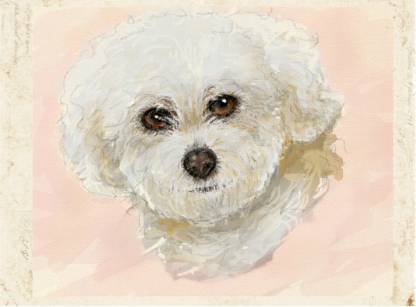
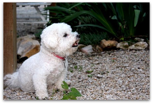
Miss Pearl, best friend to Debbie Dusenberry was a Kansas City antiquer's icon.  Debbie is a queen of the vintage scene and everywhere she was, there was Pearl. I'll miss seeing her fuzzy little face around town.

IMG_1479

Here is a photo of her when she was a visitor at the cottage one time. Pearl always came along when Debbie visited us here.

My heart goes out to Debbie for her loss.

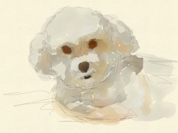
I used my Hello Watercolor ap on iPad to do this finger painting of Pearl..

Photo (2)

The ap is very interesting, and you can more tell from the rough sketch that I started with, just how much it looks and acts like real paint. Except with no brush. You use a fingertip or stylus to paint with. You can chose different brush-like features, and sizes, and whether you are using wet or dry, to get just the look you want.  My problem with it, is that I can't quite get the paint detailed enough, so I switch to the colored pencils function to add the finer details and sharper lines at the end.

I think a lot of people get to this point of a painting (the sketch) and think it looks awful, or nothing like what they want it to.  Sometimes newbies don't realize that most artwork is all about the details or the layering.  There is often a point near the beginning when you are horrified at what is on the page and think about stopping. The trick is to not give up, and to not judge the end by the early stages.

 This painting has a heavy use of white pencil over the underpainting. In real watercolor that doesn't really happen, you need to save your white paper. The ap can be much easier to use than real paint. It even has an eraser.


Family art

collections, cottage, family, paintings

Mary1920

While redoing the guest room (like I said, it never ends, a redo steam rolls!), I gathered up some old family photos and drawings that had hung in there and moved them to make a display in my stairway.

This is a drawing I did of my grandma about 30 years ago, from a photo of her as a young girl. The frame had broken, so while it was out, I gave it a little revamp with some color pencils and I've done a bit of digital editing to it, by cropping and adding a background of text from a handwritten note by her mother.  I'm going to reframe it to go with the rest of the pictures on the wall.

Cottageguestroom 029

This is how it looked before I added to it.

Of course, the original doesn't have the text, that is just in the digital copy. But I did add color by hand to the original, not digitally.

Cottageguestroom 030

This sketch is of my dad's mom, that I did at 16.  

Cottageguestroom 032

This is a watercolor of her husband, my grandfather Harry, done a couple years later.

Cottageguestroom 031

And a quick sketch of Ryan as a little boy.  (with his Kevin Bacon hairstyle, he LOVED Footloose as a kid)

Cottageguestroom 033

This one is a watercolor that I did of a photo of my husband's grandmother, Gladys. The photo sits on a quilt that she had made. 

Cottageguestroom 034

The collage of my sisters and I is a more recent work, but not all that recent.  7 years ago, maybe? Before I discovered photo editing, that photo I used of us is kind of dark.  We are standing by a road sign for Downey street, our maiden name.

Cottageguestroom 027

As I was hanging the pictures in the stairway, I knew that not a single art piece was a good example of work, and that none of the frames went together well. It is a hodge podge grouping, of some cool,  some cheap frames, some really nice antique frames, old photos, and some so-so drawings, that don't really have a cohesive look together.

But all are meaningful to  me.  And a home can't  have all perfectly groomed decor, or it becomes a showhouse, not a home.   My house will always have a place for so-so artwork, family mementos, and sentimental items.  Even if they aren't the prettiest items around. Maybe someday, I'll reframe them all in a better way, but for now, I just enjoy walking by them and seeing them as is.


PS- I've got 50% off the Boutique right now. But you MUST use this link:


 http://www.karlascottage.com/?code=Fling


to get to the sale site.  If you go through the regular link, the 50% off won't register. If you can't click on it to get to the page, you might want to try cutting and pasting it to your browser. Thanks for helping me spring clean!


Aging a picture with crackle

Hand painted, Hand Painted Furniture, hand painted signs, how to's, how-to projects, paintings

1

I was asked about this picture in my new guest room, so thought I'd give a quick how-to.

First, find a botanical, or other picture you like. Glue it to a canvas.

Next, tear and collage old papers around it. I chose a background of sheet music with an oval "frame" of roses torn out of old wrapping paper.   All are rough, torn edges, different shapes, and glued down with white school glue.

Pinkbathroom 004

When dry, I clear coated it with water based Polycrylic from Minwax.

Pinkbathroom 003

I let that dry, then brushed on a weathered crackle finish by McClosky.  

After that dried, another coat of Polycrylic went on.

The next day, I wiped on a sepia tinted glaze, let it settle into the cracks made by the weather crackle, and wiped it off. 

Cottageguestroom 016

Weathered crackle finish usually is applied over paint, then a second coat of paint is used over it to create a crackled paint finish. 

But, water based clear coat is much like paint without color, and creates the same effect.  But this way it is tone on tone, and clear. So, adding the sepia glaze shows off the crackle and ages any paper or canvas you do this over.

CrackleFinishCanvas2

Here is a picture I used this technique on years ago for a Romantic Country article. The teapot is a photo copy of one of my original watercolors. 

For this one, I glazed over it after it was in a white frame, concentrating the sepia tone heavily in the corners, and also using it on the frame too.

Photo (4)

 I sincerely hate the look of crackle applied as it is supposed to be used, it is soooooooo fake. But I love it to use in aging a picture. And in aging other things too. The trick, to me, is to keep it tone on tone, to add texture.

Here, I took an old piece of scrolly metal. It was antique, but it was not painted and I didn't want the paint I added to look too new. 

So, I painted the piece white, did the crackle, then a clear coat, then the glaze. Over that, I did the hand painted roses.

984271_10153011057194477_3476767174569364117_n

Same technique was used here on this canvas before painting roses.

Instant age for a brand new painting!

Mom

family, paintings

6a00d83451ead569e201630172dcdb970d-500wi

Happy Birthday, Mom. I'll always miss you!

984271_10153011057194477_3476767174569364117_n

These are some roses I painted recently. She'd have loved them. She liked anything I did, no matter what. You just don't have a fan base like that once your mom is gone, do you? 

A Grand Fairy Indulgence, or the chain reaction of redos keeps on

cottage, Hand painted, Hand Painted Furniture, paintings

Pinkbathroom 032

When I was showing Dewdrop the paint chips for the guest room, she came up with a brilliant plan.

 I should paint their bathroom pink.  

The cute part was  when she tilted her little head, tapped her tiny chin, and acted like she was really making a deep consideration about the color.

 Which is funny, because in her mind, PINK is the only color that should exist.

And since I kinda like some pink myself, and since I'd been redoing and shuffling things around the house, and was still in that mode, I said, "Great idea!"  And went for it.

Pinkbathroom 029

And anyway, when redoing the guest room, I moved a piece of furniture to the studio, and when I redid that area of the studio, I no longer had a place for this sweet little tin box covered in old wallpaper.

So, heck, I needed to redo the bathroom to make a spot for it.

Right????

Pinkbathroom 020

The shower curtains were due for a freshening  and needed to be taken down to be washed. The room used to be grey, and the shower liner was tan, so I bought a new white liner. That alone really brightened up the space.

 There is something about dull, Kansas winters that makes me want to brighten and lighten. I felt so much happier with my pretty, soft pink, sparkling walls and white shower curtain.

Pinkbathroom 021

The best part of the pink is that sparkle.  I dumped a few gold and silver glitter bottles into the paint before rolling it on. But to make it really dazzle, when the paint was still wet, I gave it a fairy dusting.

I filled my palm with glitter, and blew it onto the wall to stick to the wet paint.  Perfect results! (Unless you consider what a mess the floor was, and how much of it got tracked through the house. Which doesn't really bother me. I like to leave a trail of glitz and sparkle every where I go, and apparently the dogs do too.)
Pinkbathroom 019

And while I am pinking up the bathroom, I am considering de-pinking the kitchen.  I moved one of my paintings from the kitchen to the newly pink guest bath. 

Pinkbathroom 024

The door stayed gray. I liked that neutral shade with the wall color. I almost painted it white to match the trim, but am glad I changed my mind instead of the door color.

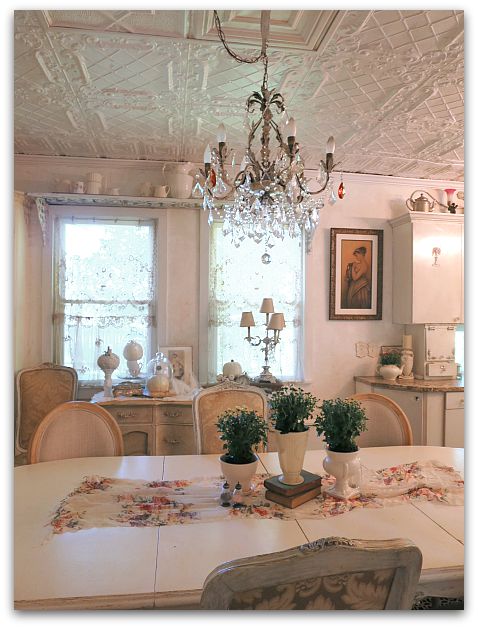
I also left the old tins on the ceiling rustic and natural instead of painting them all white, like some already are.  And not just because I detest painting ceilings, but because the roughness of the rust helps cut through the sweetness of the pink.

Pinkbathroom 023

And there is plenty of sweetness going on.  Previously, there was a similar wall of mirrors. The largest and smallest were here with two other ones. But in looking around the house, I realized that I had two more mirrors with a rose patterned frame and I switched them out and added them to the other rose rimmed mirrors.

Pinkbathroom 027

Dewdrop hasn't been by to see it yet (as I am writing this ahead)  but Sugarwings was very pleased. And I am too. It is so dainty and pretty that I no longer can refer to it as a guest bathroom, I think I'll have to call it a "powder room".  That seems to fit it so much better.

Pinkbathroom 034

There was a very ugly light fixture in there, previously it was painted to match the wall and disappear.   I thought I'd paint it white, but wasn't happy with that.  I bought a new fixture to hang, but decided I didn't want to spend that much. So far, my only expenditure was for a gallon of paint, a few bottles of glitter, and a $9 shower liner. The $89 light fixture gave me a pause, plus it was just too new looking for this old house.

Pinkbathroom 035

The tin box covered in wallpaper that had been moved from the studio, made me think of these rolls of wallpaper border I had.

A strip of old paper dressed up the light fixture just fine for me.  

Pinkbathroom 038

And I'm happy with the mismatched, vintage shades on the fixture.  They seem to suit my old cottage.

I think Dewdrop will like the pink flowers on the light.  Of course, she'd probably rather of had pink kitties…. I can't leave all decisions up to her!
A Downton Affaire

paintings, We're having a party, Workshops

California may 14 097

Once again, Kim created a beautiful environment for her event.  She never misses a detail or a chance to make something special.

Downton045

Here is a photo of the room during vendor night by our Fancy Farmgirl photographer, Tiffany.  Pure glam, huh?California may 14 104

The hotel itself was spectacular.  

California may 14 107

The table settings were sweetly done.

California may 14 108

Of course, soon, the area was filled up with loot thoughtful gifts from table mates. 

California may 14 117

And by our great kits and projects.  Andrea had us making necklaces from some softly colored pearl beads she found as vintage old stock, and lots of rhinestones on tarnished brass chain.

 And in Charlotte's class, we had needle work to do. Here is my almost finished piece, (under Andrea's kit) with very little stitching done on it.  I cut out the teacup from her kit, and used it as an applique on a vintage linen then glued a bunch of crap to it, instead of stitching all day.

California may 14 093

This is what she had provided. Pretty, but it simply was too much needlework for me to even contemplate. Although, I was proud of myself for using a needle for some of it. I didn't break out the glue for at least an hour.

I also incorporated the silk ribbons and color swatches that Kim had sent to me to match up my paints with for the banner.

When she mailed them, Kim had asked me to return the curtain fabric swatch and I completely forgot. oops!  Dang it. She reminded me RIGHT AFTER I finished cutting it up and gluing it down.  I swear, I'm lucky to remember my own name some days.

Securedownload (1)

The banner itself had a little glitch. Kim had told me to paint it 10×8', and I did, but I didn't center it, not realizing that would matter.  I left a much bigger margin on the left than the right and when she hung curtains over it, the bare canvas showed. Poor Kim had to maneuver fabric around to hide the extra bare spots on that side.

California may 14 087

She made it work.  And I was honored to have my work used as a backdrop for the gala.

Andrea Singarella, Jenn Hayslip, Tiffany Kirchner Dixon, Lori Oles

Downton301-L

This is how I finished Andrea's necklace.  I always like to do a bit of a switcheroo in classes by bringing my own supplies to add to the piece for a personal touch. (Tiffany took this photo too)

California may 14 152

In Karen's class, we were making fabric books. She had the high quality, heavy fabrics all stitched together and ready for us to add a cover and start foofing.  I brought my own cover supplies, and extra lace too.  The fabric I used is from an old Flapper dress my Sissy shared with me.  

California may 14 158

The final project was a garland of doll dresses from Pamela Huntington. I'd brought plenty of lace, so used that on mine. I also wanted some varied styles of dresses, so I cut the pattern a bit differently.  

California may 14 155

This project had my heart before I even started working on it and I would love to make garland after garland of dresses.  I decided to make a few different ones, the first all ivory and cream like the first photo, then a row of pink ones too. This was from class, then I was able to make a few more rosy ones in the hotel room on Sunday.  

My roomies checked out in the morning and I had the room till noon when it was time to go to the airport to meet Sugarwings and my husband for our Disney adventure, so I was happy to have a suitcase full of craft supplies to keep me busy a few hours.

California may 14 095

I'll have more pictures and stories from the weekend in my next posts. There was simply too much wonderfulness to squeeze into just one.


Scroll to Top