The second coloring page promised for the Farewell to Downton art journal swap is finally ready. It was something I thought I'd do on a couple of different trips, and I'd travelled with my drawing tools, but never opened them. Once I got back to the comfort of my studio, I was able to make time to get some drawing done.
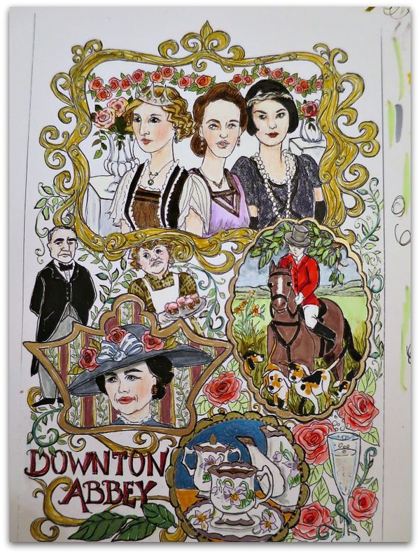
Here is one version of it colored in.
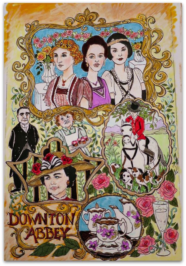
And here is one more.
There will be two different coloring pages included in the journal each participant will receive, and they will be loose pages. If you want to, feel free to scan them, make multiple copies and try different looks yourself.
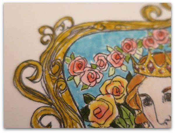
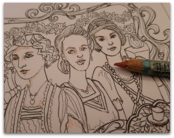
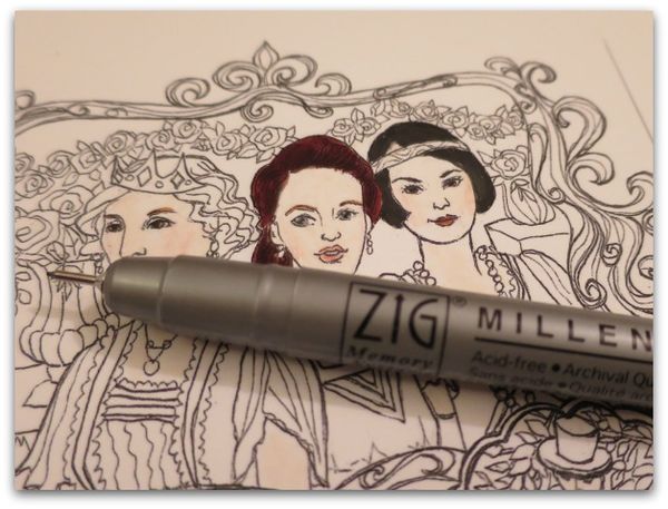
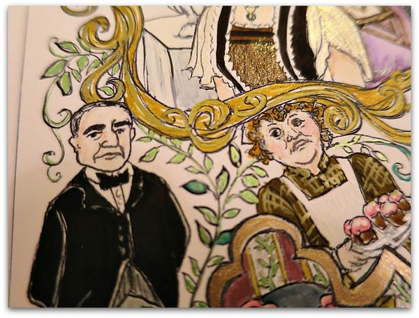
I thought I'd show a few in progress pictures of the pages I did. For the frame at the top of the picture, I used a gold glitter as a base.
Over that, I highlighted with a gold metallic pen. (not shown in this photo)
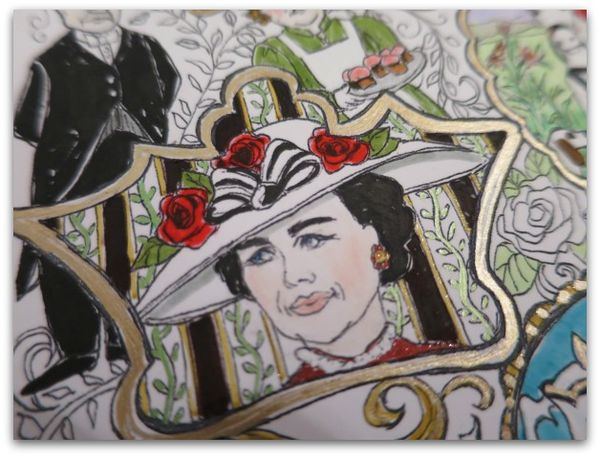
On this frame, I used the gold pen only.
For me, a mix of metallic ink, glitter markers or ink, opaque white ink, markers, and a black liner pen to go over the drawing after it is colored all used together make the page more arty looking than just colored.
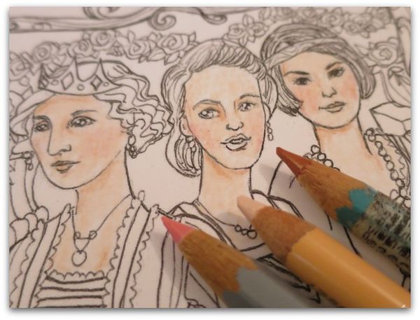
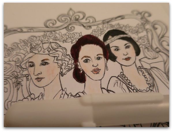
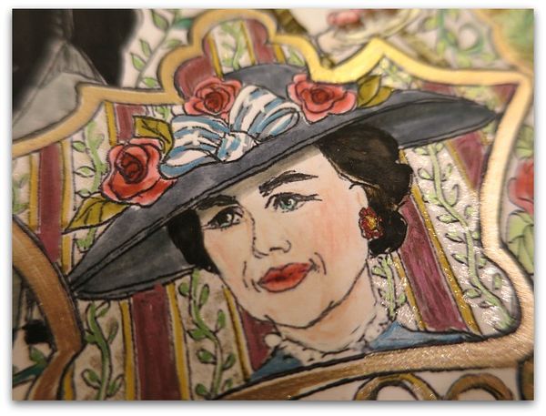
And I think that colored pencils make the faces much prettier than markers do. It is a softer look for skin tones.
For these sisters, I used a tan/brownish, a peach and a pink.
The darkest color went where you'd see a shadow.
You can find more tips for faces here.
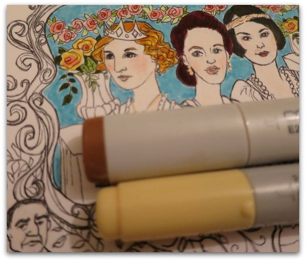
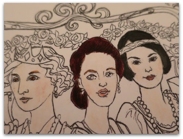
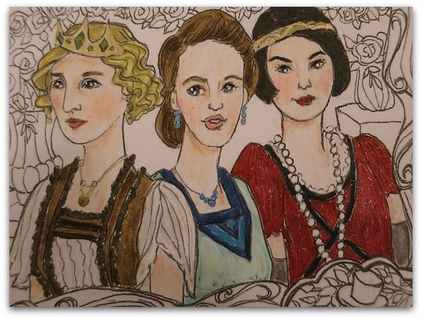
For pretty hair, I like to use at least two colors. The lighter the hair, the more important this is, like on Edith's head. But even Lady Mary got a dark brown with a black marker over it.
When I color in the eyes, I can lose some of the drawing, so it needs to be added back in.
First with a black detail pen to redo the pupils, then with a white opaque pen to add the highlights.
Much better after those details are added to the eyes.
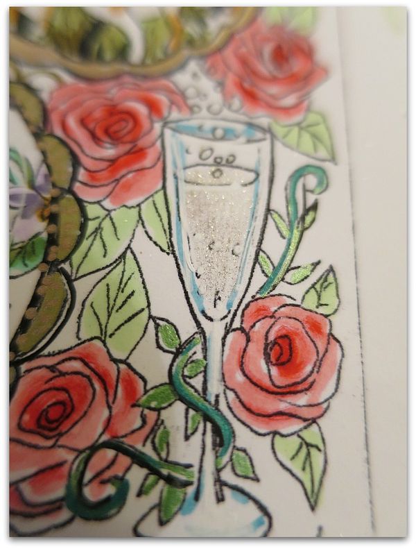
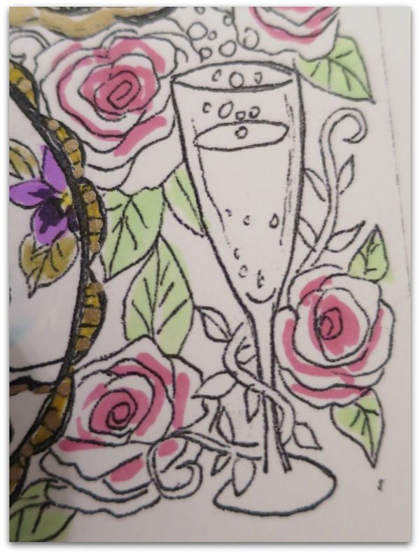
The champagne glass was done with the world's best pen, Gelly Roll Stardust Glitter, in clear. That was used on just the wine and the bubbles, then I shadowed the glass with light blue and highlighted it and the bubbles with opaque white.
These larger roses got a teensy bit more detail than the roses at the top of the page. All were done as I described in this post, But for these, I was more careful with where the darker colors went.
Instead of just blobbing the rose color onto the center of the flowers, I tried to find the shadows on the inside of the petals. Still, it was a quick process, and not a lot of care went into it, blending over the dark color with a softer pink, then adding one more dark tone to the very center evens it out and makes it pretty, without trying to be too perfect.
For myself, the most complicated part of this page was the black on black of Carson's uniform. You could get around this by using gray if you'd rather. Black marker tends to cover up the entire suit and you end up with a big, black blob if you aren't careful.
To avoid this, either use gray marker, or black pencils, or do as I did, and only draw with your black marker up to the very edge of the lines, leaving a margin of white.
Leaving some white showing throughout the drawing is very important. If you saturate every tiny bit of the paper with color, it will look flat and dead. Going back and adding highlights with a white opaque pen is good to do, and sparkles of glitter help too.
But, with this kind of coloring, leaving some white, really makes the page look better. You can be precise like I had to be with Carson's suit, or you can just have "skips" in your marker lines. Or purposely leave areas the white of the paper as a color choice.
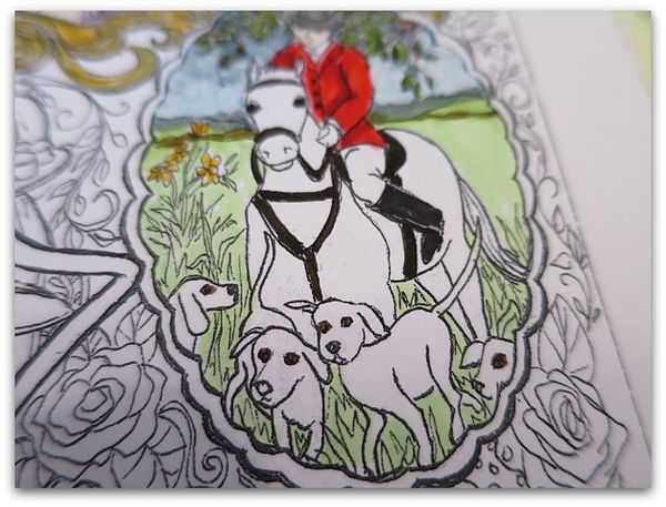
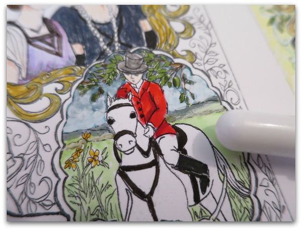
In the fox hunt scene, try to remember that colors in the distance fade and are softer than in the foreground. (at this point, the foreground is just background colors, I added deeper tones to the grass later on)
My distance colors were too dark, and tried to fix it with a white opaque marker.
That helped a little. But it would have looked better if I'd just remembered that hills and trees far away would be pastel colors.
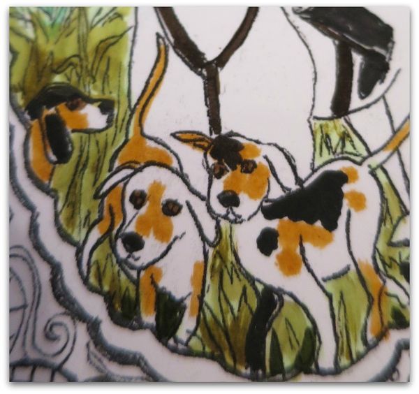
For the hunting dogs, I added random spots.
Oh, and don't forget that the animals' eyes will need a white highlight after coloring them.
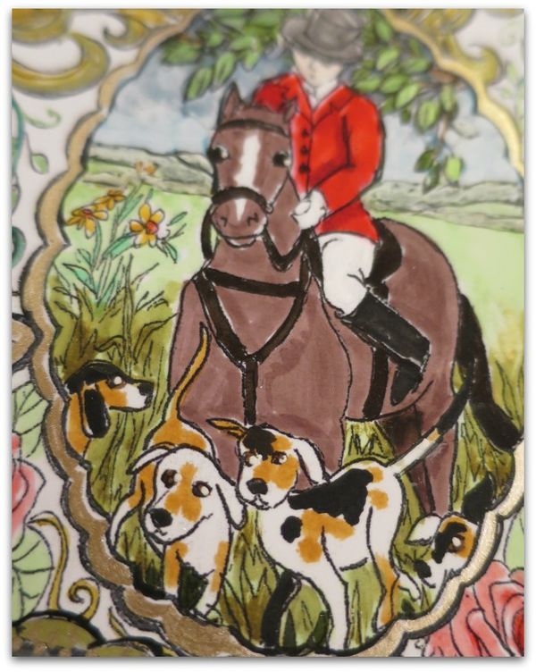
Also, the horse can be a danger zone for becoming a big blob, like Carson's suit. To avoid this, don't try to do a black horse unless you go with brown boots and tackle. I kind of like the horse I left white the best.
Trying different looks was addicting, I've colored about four of these now. If you are in the swap, I hope you will scan your black and white drawing before adding color, so you will be able to print more to color and play with.
So pretty! Thank you for the tips. I’m going to need them!
My biggest tip is to make copies and do multiples, Jan. I use either matt photo paper or premium presentation paper.
Those look SO beautiful!!
Thanks, Heidi Ann. Im really hooked on coloring.