paintings

A family painting day, and yes, yet another Art Journal

Books, family, paintings

Familypainting 001

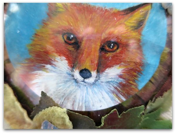
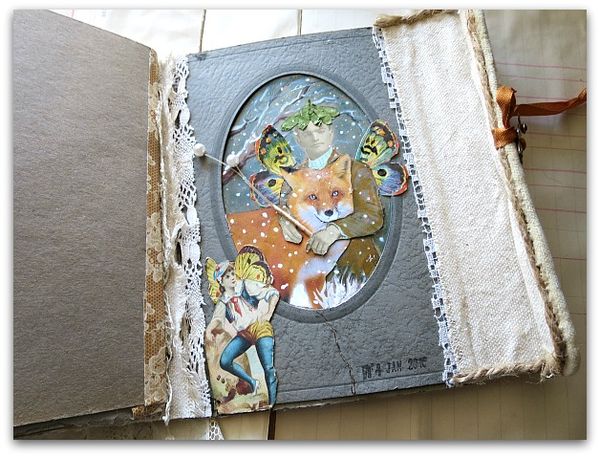
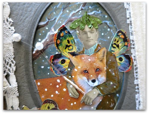
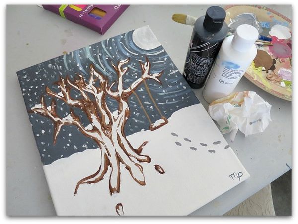
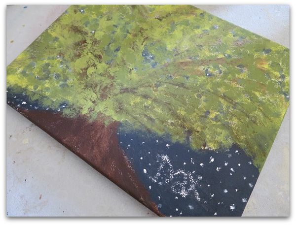
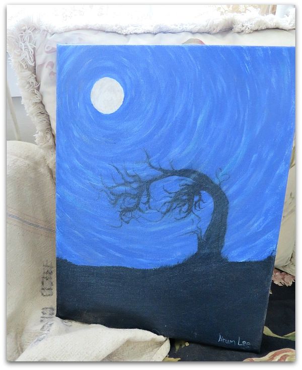
Before I set off for Florida sunshine, the family came over to have a painting day in the studio.   Miss Tree has a new nephew and her sister wanted a room full of paintings of trees done by her family. And I took advantage of having the paints out to do a little foxy picture for Guncle Randy.

Familypainting 006

My paints are typically packed away in the cabinet behind my workspace. Easy to get to, though seldom reached for.  The times when I do unpack them, I wonder to myself why they aren't always out and ready.

I really do love to paint.

But somehow that gets away from me.  I get involved with other things.

Familypainting 003

Like making books! I adore that too!!!!!!

Why can't studio days be longer? I could just bury myself out there in supplies and never come out. But, there just isn't enough time in the day to do all I want, or my house would crumble around me, my husband would go hungry, and grand fairies would miss out on snuggles.

So, I enjoy what time I do have, and make the most of it. I was happy to mingle the two genres, mixing making an art journal with a little painting.

Familypainting 008

And with collage. Another love. 

Familypainting 010

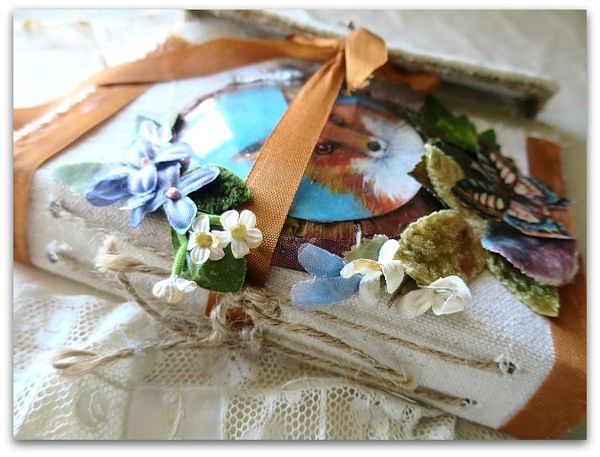
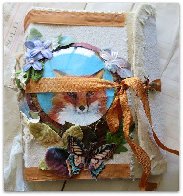
Guncle Randy is a fan of foxes, so that is the theme of the book that I made to bring to him.  Hopefully, we will have some craft time in his studio and I can watch him create on the pages inside of this book.

Familypainting 012

And I hope to have another family painting day in the studio to watch the creations filling the room. This is Kia's

Familypainting 013

And Miss  Tree's tree painting got a palm tree with a lyria hanging from it. Kia drew the acrobat for her.

Familypainting 011

Avahni added the baby's name in stars.

Familypainting 015

And my son, who is so talented in so many ways, surprised me with yet another skill.

Familypainting 016

I had no idea he could paint.  Nice, huh?  

The little girls created piles and piles and piles of dripping, glittery, pink, gloppy painted slips of paper. And smiles. There were plenty of smiles.  Too bad I forgot to put a card in my camera that day…

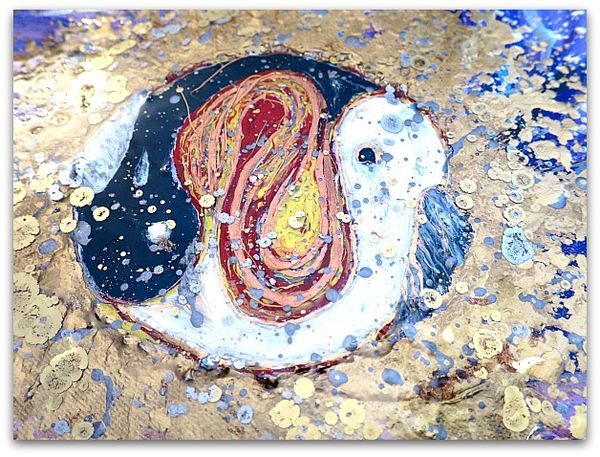
Disney terry holly 085

While I was away, my boy started this painting, done with layers of epoxy. It was a nice surprise to see it in the studio, and to know that he is exploring the world of painting. I think he has something going with this.    It is a rich, deep shine, between each layer of paint. Hard to photograph, but it is really something pretty cool to see.


Beautiful grand fairies and beautiful cloaks

fairies, family, paintings, sewing?, show and tell

Terry 001

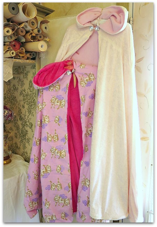
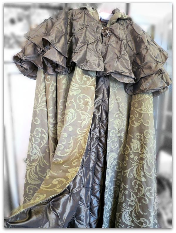
My sister-in-law, Terry is a talented person who is happy to share her skills.  When I was admiring her work on the dozen or so costumes that she had whipped up for the Grand Masked Ball that she hosted on Halloween, she offered to make cloaks for all of my girls.

At the holidays, when you know how swamped everyone is.

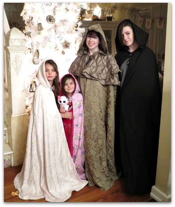
So, the big girls and I, plus Sugarwings and Dewdrop spent some time finding just the right fabrics.  That led to nice days out together and good bonding time.  I was slightly overwhelmed by the sheer volume and weight of the fabrics (7-1/2 yards each of exterior and lining!!) for the teenager's capes and couldn't imagine trying to make them myself.  But Terry is a pro and spent many happy hours creating costumes for her kids' high school plays (all the parts, not just her own children) and is an expert in this type of sewing.

Ss 001Ss 002

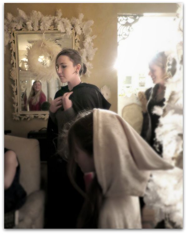
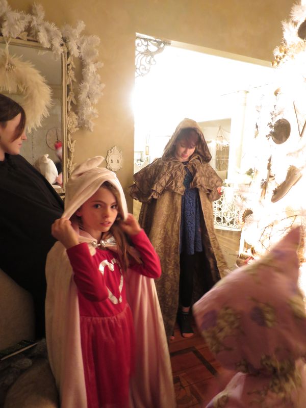
The cloaks arrived in time for Christmas and were as pretty as can be. 

Xmas 145

They were the hit of the night when the boxes were opened on Christmas Eve.

Xmas 133Xmas 131Xmas 134

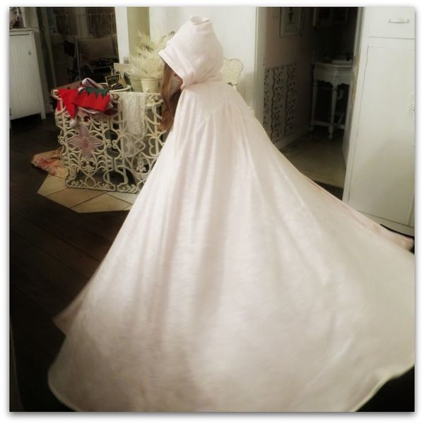
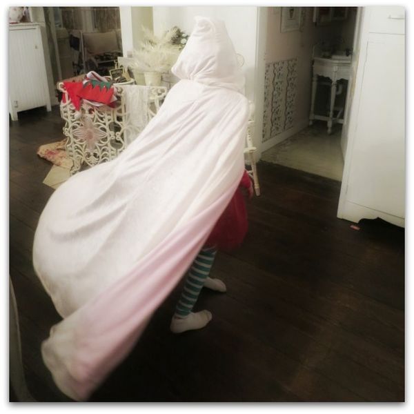
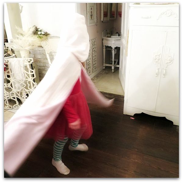
Plus, they are plain old, ideal for swirling and twirling in. 

Xmas 122
And when you put one on, you feel mysterious and beautiful.

Xmas 129


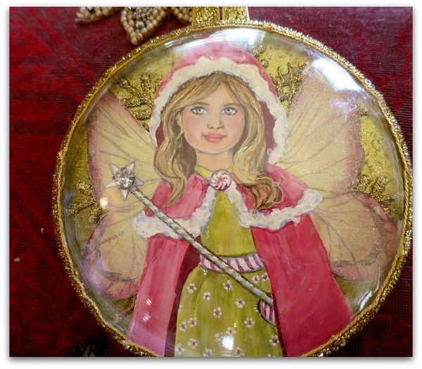
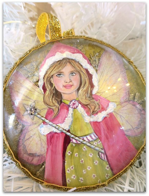
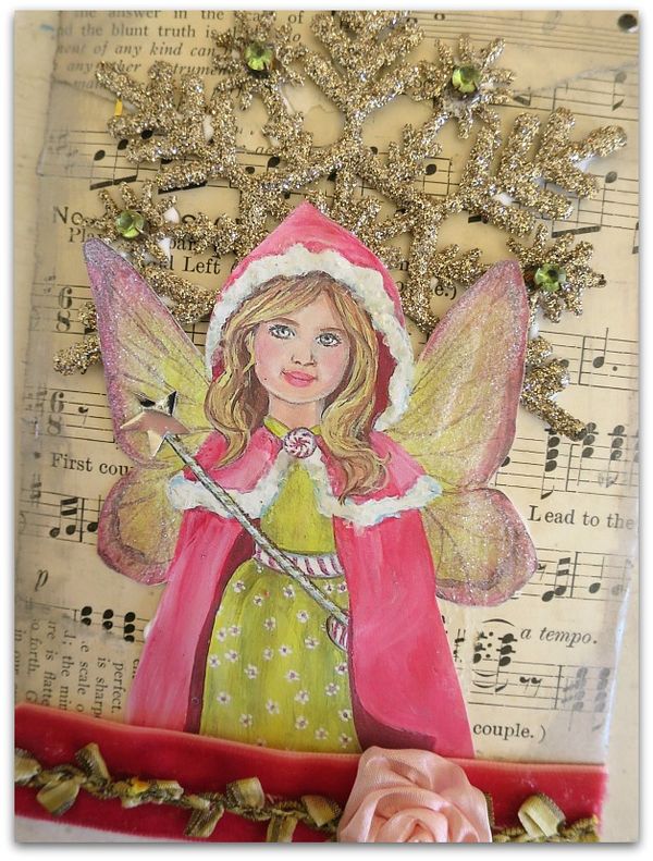
But what could I do as a thank you? I decided to do a Sugarplum Fairy painting of a sprite in a cape, and use Terry's own granddaughter as a model.  That little one has hauntingly beautiful eyes!

Terry 013

Terry is a major art collector, she owns paintings from artists who hang in the National Gallery.  

Yes, intimidating!

So, I kept it simple and turned my whimsical, little piece into an ornament.  I had a vintage picture with a domed glass and thought that would work well to turn into something to hang on a tree.

I did a small painting, cut it out, glued it onto chipboard covered in gold paper with a glittered snowflake added to the background for dimension.  Then, I frosted the "fur" with mica flakes, and the wings with fine, crystal glitter.  With the domed glass, I had space to add a nice, sparkling rhinestone to the magic wand.

Terry 011

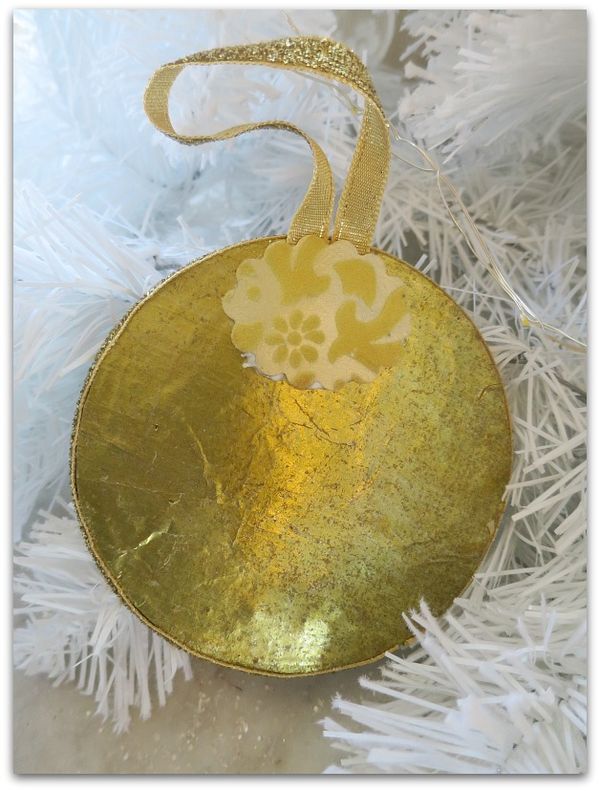
The same gold paper is on the back, and the edges are glued shut and sealed with glitter velvet ribbon. The same ribbon is looped as a hanger and secured with a bit of flocked gold paper. (the glue is still wet and showing in this picture, oops!)

Terry 006

Before putting the original painting in the frame, I scanned it to make a few Christmas cards, and this piece for my own tree.

Terry 010

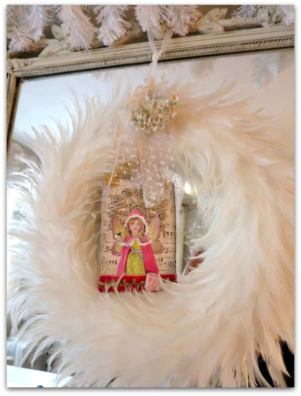
For now, it is tucked into a feather wreath that is hanging on the mirror.

I know that Christmas is over and I should be dismantling all of the decor…. but I'm just not ready to let go yet, are you? 

Painting a new chandelier to look old

how-to projects, Kitchen remodel, paintings, Tutorials

Fall decor 011

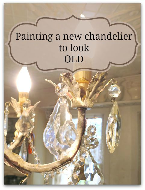
In the past, I've shared how to paint a vintage, brass chandelier.  It was the one I had hanging in my kitchen before this one. And I still use that technique when I want a full coverage for whatever I am painting.

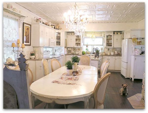
But for this project, I wanted a different look.  I was replacing two chandies in the kitchen with twin, new, dark copper colored fixtures from Home Depot.

Fall decor 068

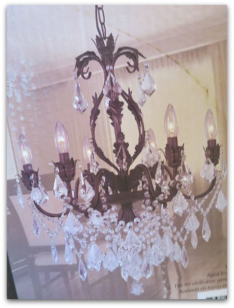
Here is the picture from the box. When I ordered them, I thought I'd like to have the dark bronzey, coppery color as a contrast to my all white kitchen.

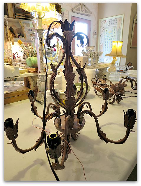
But not only did I decide that they were a little too dark, I thought they looked a little… cheap.  After owning a heavy, old, solid brass chandelier, this paper thin metal one was a bit of a come down.  I hoped layers of paint would give it some depth plus keep the contrast I wanted for the room.

Fall decor 057

I'd called the electrician to schedule getting the two lights hung up, just to find out that he had a cancellation that day and could be out that afternoon. 

Ooops.  Too soon! They weren't painted yet. I didn't want to miss the chance to get them up right away, so I looked around to see what I had to work with.

Now, you might remember that I have complained about Chalk Paint. Actually saying that I would never use it again.

Well, I've discovered that it has its uses here and there. I won't use it for large pieces of furniture due to expense, but I have learned that if you buy the small bottles at Michaels or Hobby Lobby with the 40% coupon, it is affordable for small projects.

It always needs sealed with wax or clear coat. I still dislike wax, but am happy with the results of adding a clear coat.

Fall decor 059

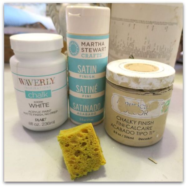
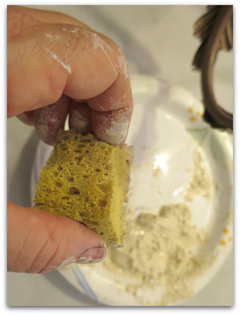
And for this project, I didn't have time to prime. So, I sponged on cream and white chalk paint.

Fall decor 065

While sponging the two colors together, I was careful to dab a small amount at a time so that the two colors didn't blend completely as I worked.  

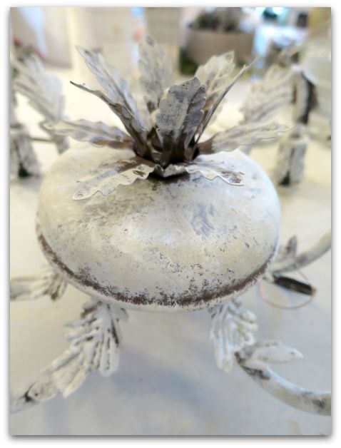
I left the crevices dark, not smooshing my sponge down into those areas.  Chalk paint is a good choice for a project like this, since you don't need to prime first. If I'd had to prime, it would've been hard to leave the original color peeping through.

TIP- Being a perfectionist isn't helpful, being a messy painter and a bit slap happy with the paint is a plus on a project like this!

Fall decor 066

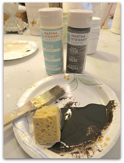
After that, I brushed on this water based wood stain that I had left over from painting my cabinets.

Fall decor 067

The stain is brushed on haphazardly into the dark areas and here and there on the sponged areas, and wiped off.  

Then it was covered with a clear, water based. top coat.

By starting at the top of one, working my way through it, turning it as I painted to get every angle, then doing the same with the second one- the first was dry enough to glaze as I finished the second. Same thing with the top coat, the first was ready to seal by the time I finished glazing the second. I was able to get both sponge painted, glazed, and top coated, then set out in the sun to dry in under 2 hours.  

And both were ready for the electrician when he arrived.

Fall decor 010

Don't forget to sponge paint the chain too!  I'm considering whether or not to add some paint to the cord… It doesn't bother me that much like this. But I'm still thinking about it.

Fall decor 009

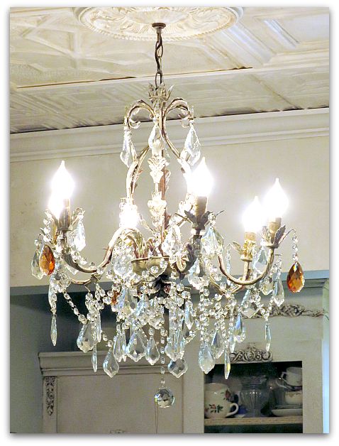
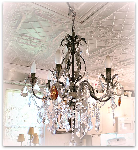
The results were just what I wanted, not as white as my old fixture, and with a hint of the copper showing under my muted white and cream. It is darker, but not starkly so.

The paint makes the light look more substantial and certainly not like it was just shipped from the factory.

Fall decor 058

Here is another before picture.

Fall decor 075

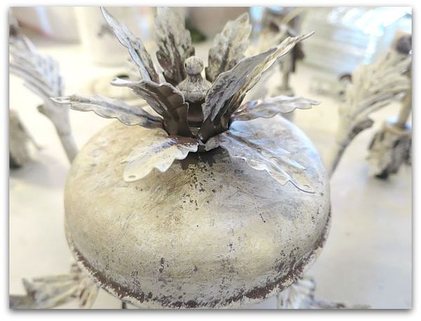
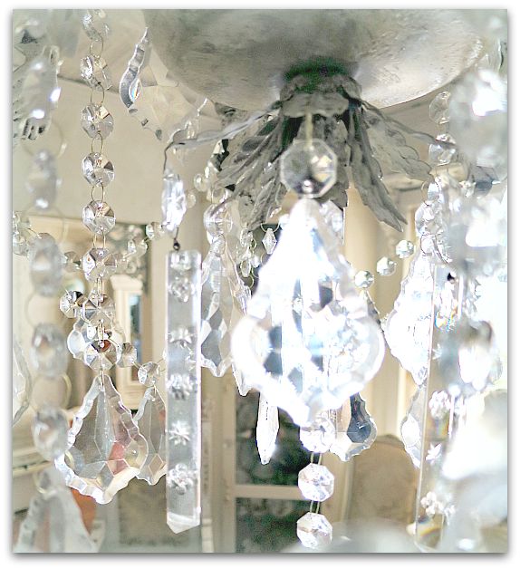
The light came with a lot of glass drops. Not crystals, I could tell the quality wasn't quite as high as the ones I'd had before.

Fall decor 074

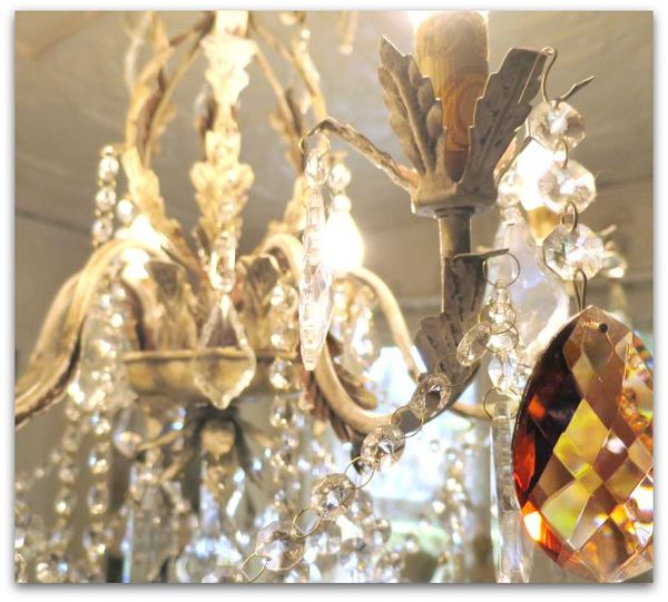
So, I added a mix of the older ones in with the new ones.   Including 3 deep colored, large ones.

Fall decor 084

Ahhhh, that's better!

Fall decor 076

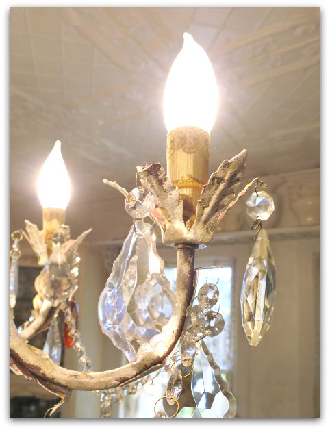
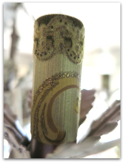
The tubes that slide over the sockets were glaringly blah after redoing the rest of the piece, so I glued vintage wallpaper to them. I thought about sheet music, and might try that another time.  It is simple to slide these off, peel off the paper and glue another type onto them instead.

Fall decor 028

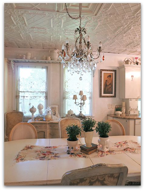
It is honestly a relief to have brand new fixtures with no wiring worries up in the room. The older chandeliers had arms that no longer lit up, and didn't hold as many bulbs. So, when not all of them worked, the room wasn't very bright.

Each of these lamps holds 6 working bulbs.  Very nice!  And I can now re-wire the vintage fixtures for use elsewhere if I decide to.  In the mean time, this was a quick, easy, and pretty affordable redo that still looks nice in my vintagey cottage.

Fall decor 075s

Art Journalling tips on using markers, metallic ink, and opaque white for coloring pages, doodling, and drawing

Books, drawing, how-to projects, paintings

Spells 021

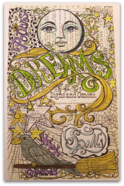
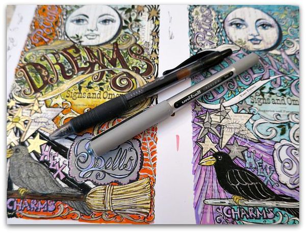
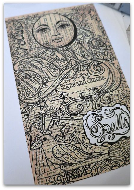
I've been working on a coloring page to add to the Book of Mysteries journal that I'm starting to build kits for (will let you know when those book kits are ready).

When I finish a coloring page, I can't wait to start coloring it in! And it is a good idea to do that, because I find some oddities here and there that might need fixed before sharing it.  I also like to have some examples of how the pages look when completed with color, to give other artists an idea of what to do with the blank pages.  

Spells 022

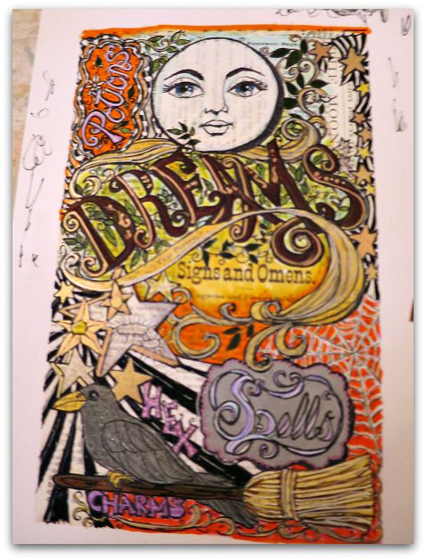
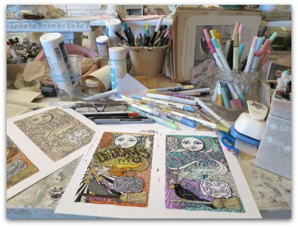
Of course, who could stop at just one? These are ADDICTING.     I spent all day yesterday drawing, cutting and pasting, then tinting the pages.   Here is one in more traditional Halloween colors.

Spells 028

And this one is fall toned.

Spells 010

I thought I'd break down the steps to show you how I layer the markers and pens in case you'd like to make one.

First step?  Light colors as an undercoat.  

Spells 014

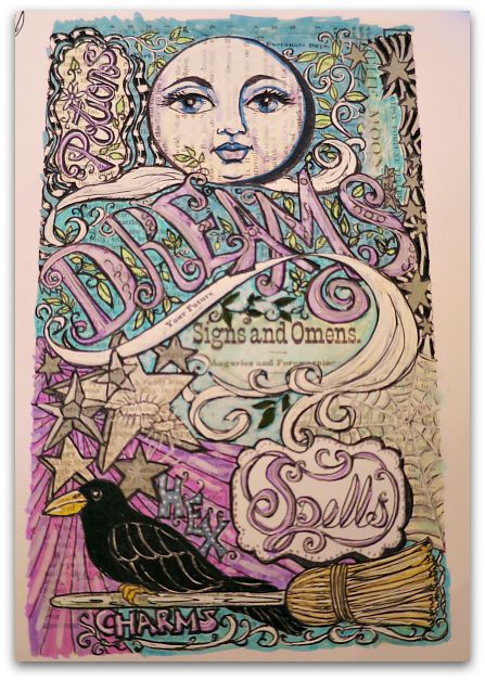
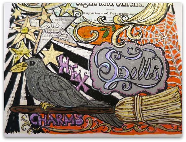
The more layers the better. I used a soft blue with pale purple over the letters on 'Spells'.

Spells 016

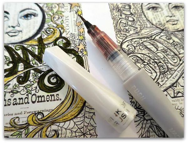
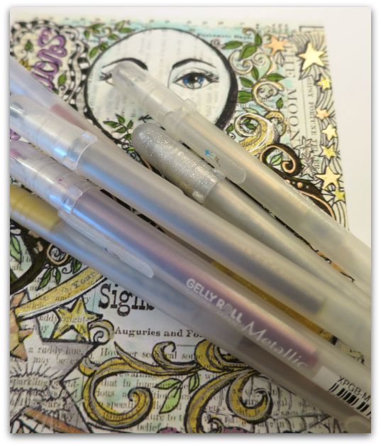
Around the word, I painted in a silver glitter, with my favorite new tools, the Stella Wink glitter pen.

Over that, I used a metallic ink in orchid to do a border of dots.  Then, I redrew all the black lines, and used an opaque white pen to add some highlights to the letters.

Using the white pen to highlight makes a big difference, see how I've used it on the broom too?  Over the pale yellow, I drew some brown lines as shadows, then went over the whole straw area with a darker yellow, and added white highlights over that.

The orchid metallic pen dots on the frame for 'Spells' are repeated on the word 'Hex'.  I like to repeat colors or patterns throughout the piece.

Spells 012

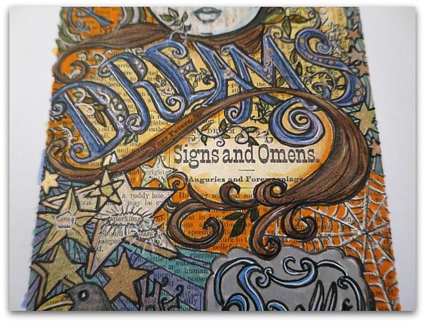
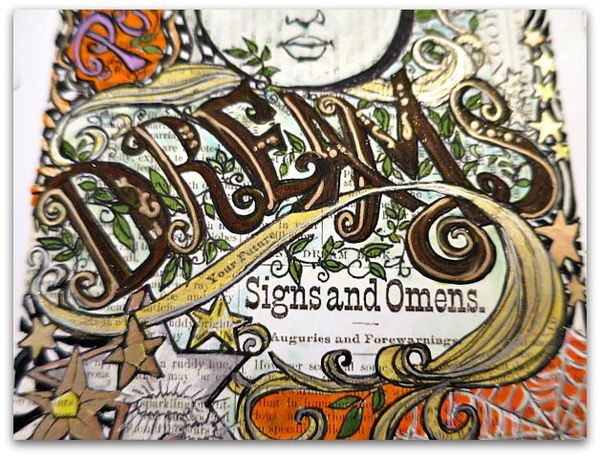
The Wink pens have a thin, brush point and pack a lot of sparkle. I did a layer of the copper over the previously laid down bright green on the word 'Dreams'.

Spells 018

A darker green went over the leaves, and the soft blue was lightly used in the background.  

With a variety of metallic pens, I accented the word 'Dream' , the yellow banner/swirl/thingy, and the stars.

All of these were re-outlined in black afterwards.

Spells 025

It is smarter to redo the black outlining at the end, so you don't smear it, but I have a bad habit of using it on each area as I work on it, then I have to be really careful with the next step. I'd say do the black last!

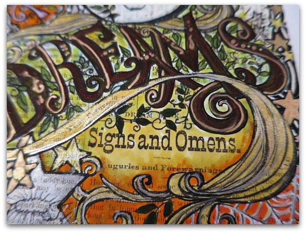
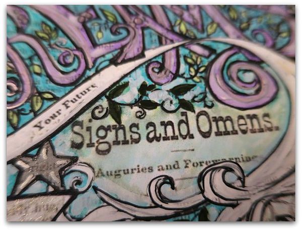
I have gone over the soft blue with pale yellow.  Here and there, not everywhere, I used a blending pen.  The blending pen was used much more heavily over the orange, where I added it along the yellow under 'Signs and Omens.'  

Notice that there are some skips, where I don't completely cover the background? Some of the paper shows through. This is an old, watercolor trick, and it adds sparkle to the page. If you cover the page 100%, it can look flat.   Those little skips give the page some life. 

Spells 015

Over the yellow banner, I then drew on some Gelly Roll Stardust in clear, and rubbed it with my fingertip. I adore that look, it is something my Sissy showed me years ago and I've used it a billion times since then.  The Stella Wink pens have a similar look, but don't blend as well, they go on more like paint. I love them both, but if you want just a hint of glimmery shimmer in small spots, you can't beat the Stardust in clear.

Also, using a mix of distress markers, opaque markers, and metallic pens, gives the picture a lot of depth.

Spells 013

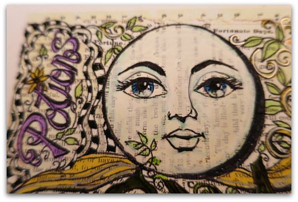
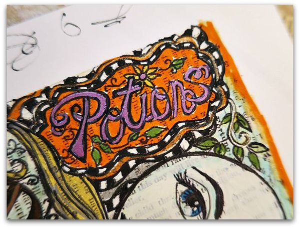
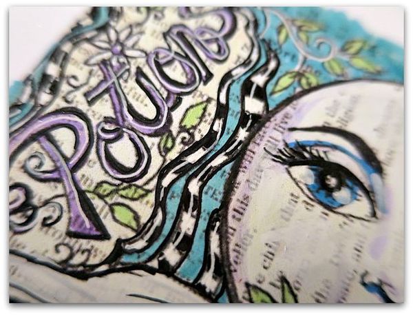
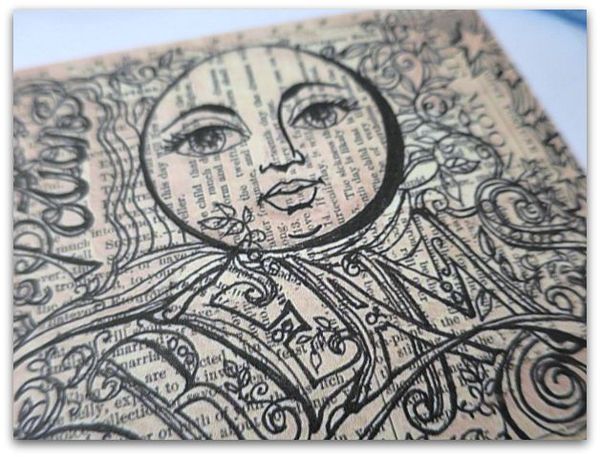
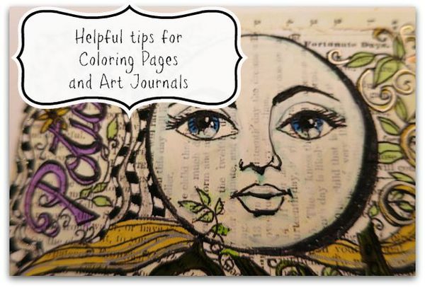
For the moon face, I first washed soft blue over the shadow areas with a Tim Holtz distress marker, basically following the drawn lines. I colored in the irises with it too. Then used a dark blue over the top half of the irises.  Over the entire face,(avoiding the eyeballs, but  covering the eyelids) I used the opaque, white marker.   I made a dot with that over the bottom right hand corner of each iris (same spot, both eyes).  All of the black was re-outlined, and the pupils were blackened, then with the white opaque pen, I added two little dots to them.

Spells 020

Re-outlining with the black marker makes a giant difference in the completed piece.  I usually work with an art marker, but found that going over metallic pens kills an expensive fine point marker, and the best tool is a uniball or plain, old, ink pen.

Spells 017

Little details can give you big pay off.  I like the way the black and white check really pops of the the page, but one more step…


Spells 027

Of drawing a line through the center of the checks with the opaque white pen on this page, adds dimension.  I did the same with the purple letters.

Spells 026

On this one, I drew the banner/swirl/thingy white and accented it with the clear Stardust pen.  The same white opaque marker was used over the purple letters in 'Dream' and over the background colors of soft blue and light blue.  

Spells 029

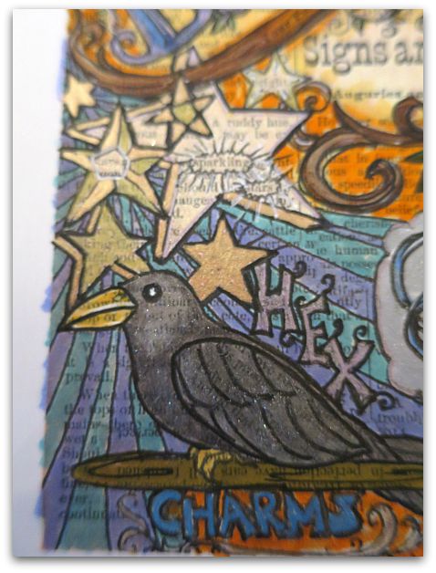
For this raven, I used grey marker, and the Wink marker in silver, outlined it again in black.  The beak is two layered yellows, with white highlights. The black,beady eye gets a double dot of white too.

(Notice that I'm not all that careful with my edges? Once the piece is done, I cut it out, that cleans the border up)

Spells 033

These are formatted to print out to fit into the journal I'm designing. One blank page, ready to color, will be in each kit.They will also be available as a digital download so that you can print out and color as many as you'd like.  You'll be able to find them in my Etsy shop.  

Spells 031

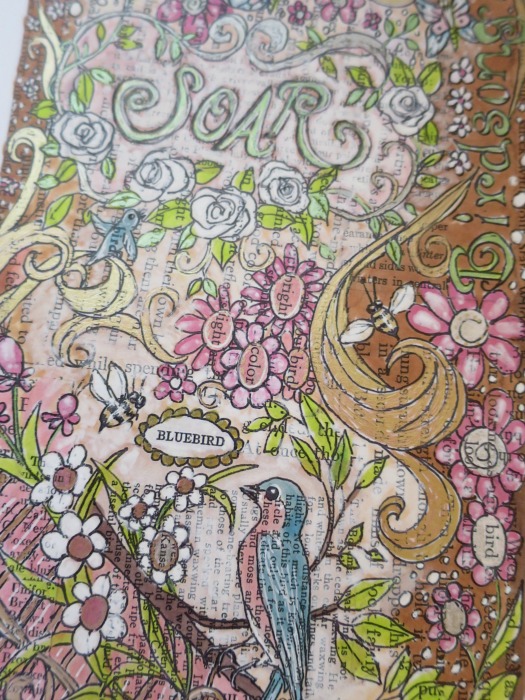
They start like this. I used pages from a 1930s fortune telling book to make the collage underneath the drawing.

Spells 006

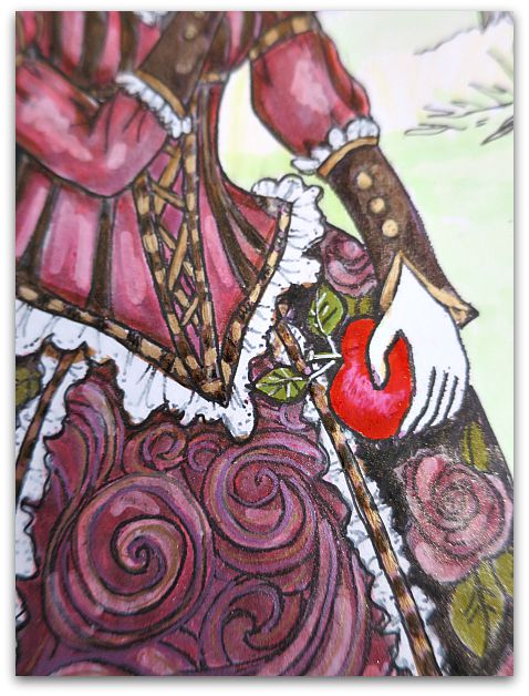
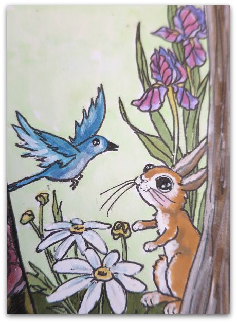
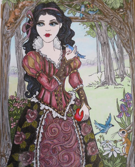
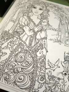
You can also find this Snow White coloring page in the Etsy shop too.

Spells 002

I colored this one the same way as the Spells page, using lotsa layers, and a mix of markers, metallic inks, opaque markers and pens, as well as a blending marker.  I've recently discovered those and really like them.

Spells 004

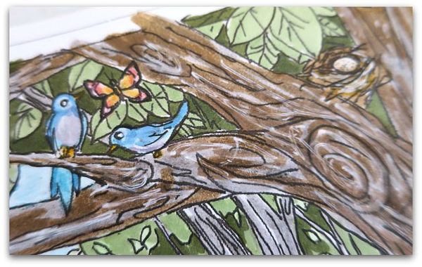
For this tree, I used gray distress marker, with brown over it, in most spots, then blended it and added white pen.

Notice that the trees behind it are just light gray? When doing a landscape, please keep in mind that the further away something is, the lighter it looks.

Spells 001

The trees along the horizon are done with very soft pastels, and the foreground is done in brighter colors.

I used the blending marker very heavily on the grass. With big areas, it is important to not have lots of scratchy looking marker lines.

Her eyemakeup is done with the Stella Wink marker, but I think I liked her better without it.

For the black hair, I first colored the waves in blue and purple, then layered with gray.  That way, it still has depth and isn't a flat color.

Spells 003

And you can still see the hand drawn lines that make up the waves.  The lace is light gray near the neck, with opaque white marker over it, then outlined in black again. The little bird is blue on top, pink on the bottom, white opaque marker over the pink and the line where the two colors meet. That opaque marker is a wonderful way to blend.

Spells 032

These tips are great for any coloring pages, or also for your own doodling or drawing project.


Spells 013s

 Remember, layer, layer, layer, for a more arty look.  

How to paint cabinets with NO PAINT and NO SANDING at all, and some Venetian Plaster tricks

cottage, how to's, Kitchen remodel, paintings

IMG_4867

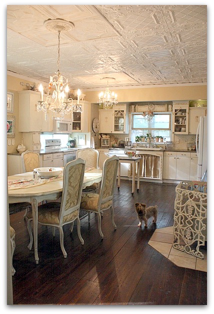
I've been redoing my kitchen recently. Here is a before photo, which isn't bad. But- this was a couple years ago and there has been some wear that required touch ups.  The swags on the glass cabinet fronts had been knocked off, and those two cabinets had to be sanded down after taking off the cracked remnants of the trim.  I no longer had the same paint color, plus, those cabinets hadn't been repainted in a long, long time.

I've been jonesing for an all white look.  (hmm, does that term age me?  "Jonesing" might be something we said back in the 70s) For years, I've loved that look, but have never had it in my own house.  I tend to go cream, tan, or ivory when I decorate. But I've been drawn to photos of pure white rooms and always wanted one of my own.
Kitchen plaster 020

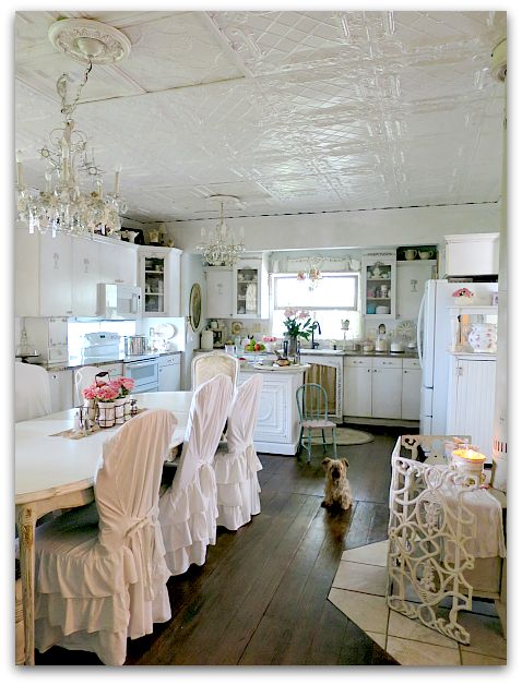
And I got it!

Kinda.

 And I really, really do love it. I kept quite a bit of the ivories and creams, because I still love them, and like the mix. But the overall effect of the room is pure white. Especially in photos.  In real life, you can see more of the textures and tones, and the room feels a bit warmer than the pictures show. 

But still white.
Kitchen plaster 027

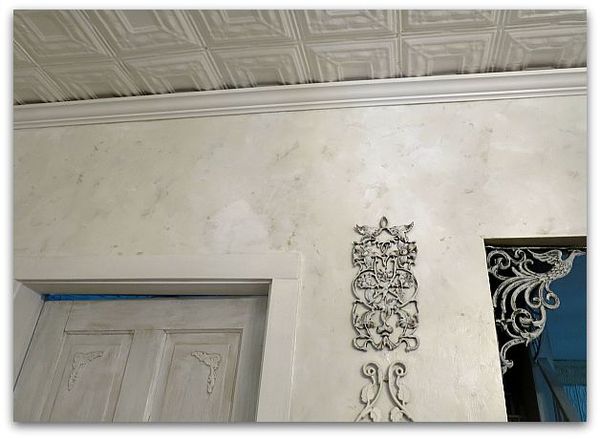
To pull off white without the room looking stark, I felt like textures were important. The ceiling is already quite texturey from the vintage ceiling tiles, and the doors are dry brushed with 4-5 different whites and creams. (Which happened at first by me touching up paint every year or so, and dry brushing over smudges and finger marks with a different paint that was already on the door. I liked it so much, I just dry brush various whites onto it when I repaint periodically- a happy accident that turned into an "I meant to do that" situation.

And for the walls, I used Venetian Plaster by Behr instead of just paint.  
Kitchen plaster 001

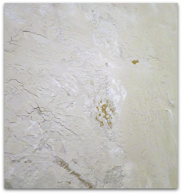
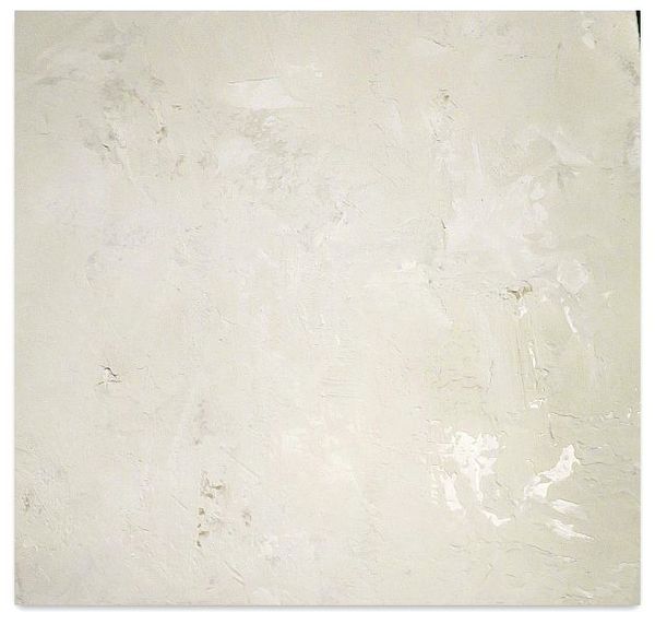
The walls were already kind of a tan, which made a good background color that I let peek through in some spots.  But the plaster color chart didn't sport any choices that I liked, it was pretty limited. So, I went  with plain, untinted, as is, plaster straight out of the can.
Kitchen plaster 004

Trouble is, it was a tad bit gray, not as bright as I wanted.  I fixed that by using Behr pure white paint along with it.

I scooped out about two cups of plaster into a paint tray, and poured approximately 3/4 cup of white paint over it.  Next, I took a 6" wide, plastic dry wall or putty knife thing and troweled the mixture onto the wall. It mixed as I troweled, with some areas more white, some more gray, some both.
Kitchen plaster 031

This is NOT what the directions say to do.

But it worked for me.  I went around the room 3 times, doing this.  I also didn't let it dry as long as the directions said, or hold my trowel at the same angle that was suggested.  I didn't burnish it either.

I held the blade pretty flat against the wall each time, the coats I made were thinner, which is probably why I needed three instead of the recommended two. (If I could do much math, I'd tell you the angle)

It was looking like there were tracks in it from the edges of the knife, so I took my red handled Tim Holtz scissors that I love so much, and that will cut through everything, and trimmed the edges of the blade to a curved shape.
  Kitchen plaster 028

Over the top, I put three coats of Minwax Polycrylic clear coat (water based- satin). I used three because I like the depth that gives the plaster.  I was hoping for a marble-y effect.  

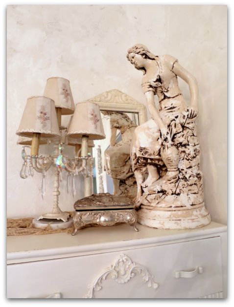
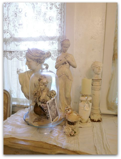
I think that the layers of subtle colors on the wall give the room the light, bright, white feel I was hoping for, but still blend well with my ivory curtains and whatnots around the room.
Kitchen plaster 006

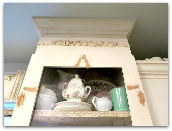
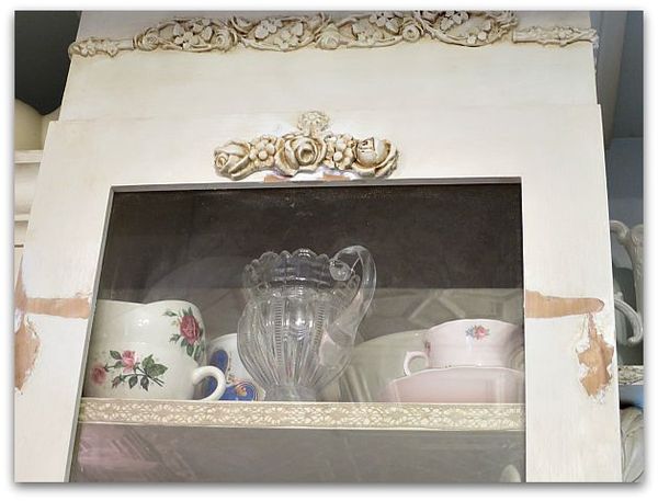
After the 3 top coats on the wall, I started in on the cabinets. The broken swag embellishments had to be pried off, then the wood sanded down.
Kitchen plaster 009

I salvaged the roses from the center of two of the swags to glue to the top of the glass.  
Kitchen plaster 012

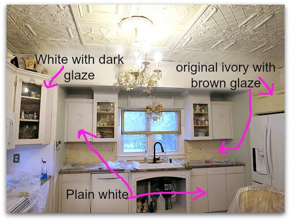
Here is an in progress picture.  Some of the cabinets painted white, some stained, some as is.

Next, I painted them with bonding primer.  I didn't want to sand the existing paint, and if you use a primer that says "will adhere to glossy surfaces" or "bonding" you don't need to sand.  Even over oil based paint, like I had used on the cabinets originally.  Very much like in this tutorial, but with a brush, not a spray can. Kind of like we primed cabinets in this post.

It took two coats of primer to get a good cover.  I used one of those small rollers meant for smooth surfaces.

I sincerely loved the white, white, white look of the primer.  BUT- I knew that I couldn't live with that level of cleanliness, too many people worked in my kitchen, too many big meals were prepared there.  Too many splashes down the fronts of the cabinets. Now, I'm not saying I'm a pig, I do wipe the doors off regularly, but not every ten minutes.

So, I decided to add a dark glaze.  If done right, it wouldn't take away from the whiteness, it would just accentuate the rose embellishments and help hide smears that happen as we work in the room.
Kitchen plaster 010

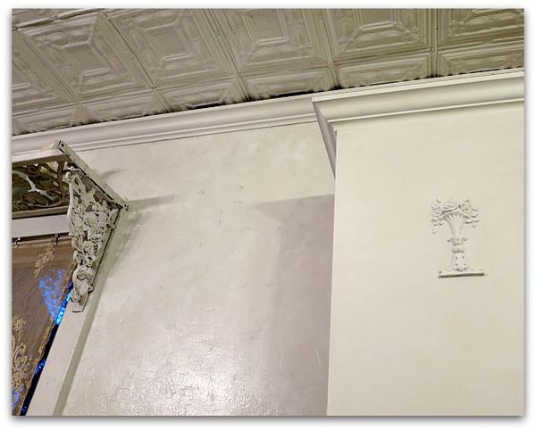
This picture is of a primed door.

Since I decided to use a glaze and a  water based clear coat, I decided that I didn't need to do the painting step.

You CANNOT use primer alone and leave it! It is meant to be used under paint. But- glaze is a form of paint, and water based clear coats really aren't that different either. 
Cabinet 004

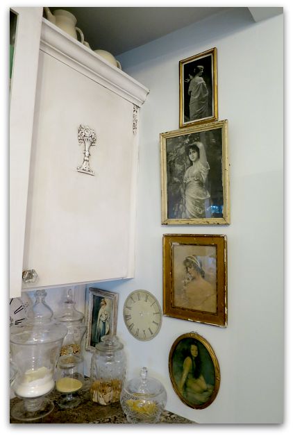
But then, instead of tinted glaze, I kind of experimented and used Martha Stewart wood stain (water based) because it was on clearance at Michaels and because I liked the dark, dark walnut color of it. I thought that it would look great with the granite countertops, and could be used directly from the bottle, no mixing like I'd have to do with glaze and paint. 
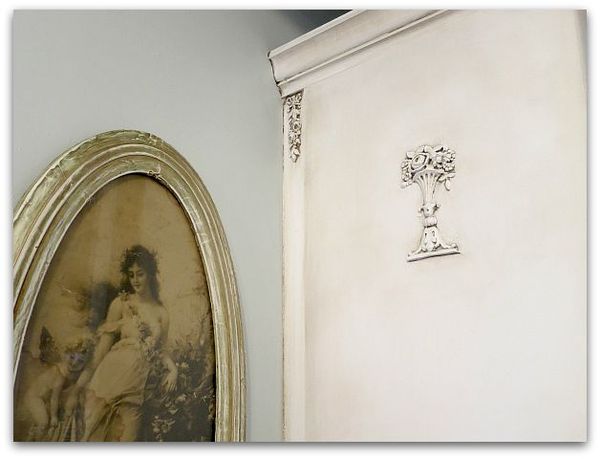
Cabinet 003

I discovered that glaze might be easier, the wood stain had a learning curve.  The trick is to work in very small areas at a time.

First, I brushed the deep color into the embellishments, and wiped it off with a damp rag. Then I buffed it with a dry rag.   After that, I ran a brush full of color all the way around the edges of the door, and blended it with the wet, then the dry, soft rags again, working the color from the outside toward the inside.

If I got it too heavy, or if it dried too quickly for me to get the blended look that I wanted, I found that a wet, Magic Eraser was perfect for lightening up any mistakes!

The crown molding was simple, brush color onto a couple feet, wipe, and keep going.
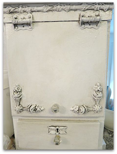
Cabinet 002

These new tones actually match my countertops much better than what I originally had used. Because I'd painted the ivory oil based paint and a coffee with cream color glaze onto the cabinets to match a granite sample that I'd picked out when the kitchen was first remodeled. 

Then, the granite was cut wrong! And we had to pick another similar piece, which wasn't nearly as golden as what I'd first had.

So, for years, I kept thinking I'd redo the paint job, and am just now doing it. And I am so pleased that I did.
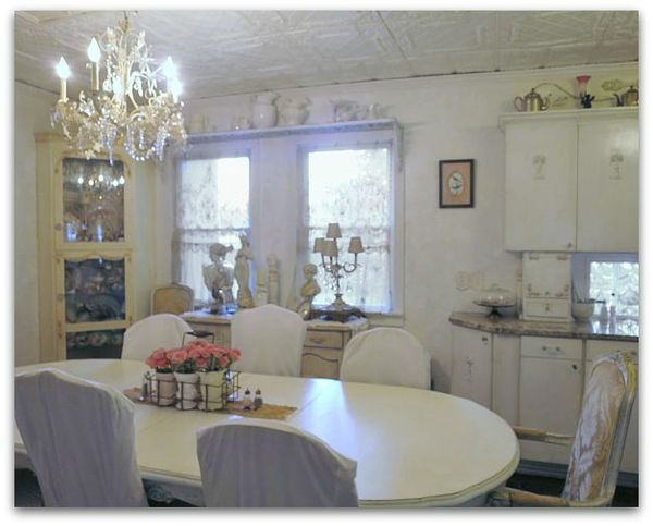
Kitchen plaster 026

For now, I've left the corner cabinet as it was.

Let's not say that 3 solid days of troweling on plaster, climbing up and down ladders, and twisting around to get into the corners of the cabinets along the ceiling, were too much for an old broad and I was too tired to tackle one more cabinet.

Let's just say that the contrast is nice, and that it kind of ties the mixes of whites together, ok?
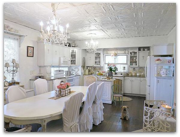
Kitchen plaster 016

I used a semi gloss clear coat on the finished cabinets for durability. If I didn't have such a high traffic kitchen, I'd have gone with satin, because I like that better. But I'd rather it repelled messes. The higher the gloss the more durable a surface is. 
Kitchen plaster 029

I've always said that with neutral tones in the basics of a room, you can change the look with just a few accessories. I think this will be even more true with these clear whites.  And I do like changes. This room can stay white on white, or with a few red accents can have a totally different look for the holidays, still keeping that romantic, serene feeling that I wanted. 

Yep, I think I'm loving this!
 

Coloring Pages for adults, fairy tales and birds

drawing, Etsy Goodies, Hand painted, paintings

Sss 002

I've been hearing a lot about coloring pages for adults lately.  And last week, in the Parade magazine was this article about them.

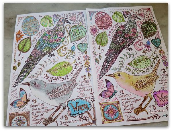
Over the last few years, I've been doing what I call "doodle pages" and including them with journal classes and swaps.   Most of mine are done over collaged, vintage text pages, and some are actual pages of tips and how to's on how to make your own. I still have a couple of those kits left here. I also have that info and the pages to download in my online, "Creating an Art Journal" class.

Cp 001

When I was working on these pages for my Birdsong 5 kits, I was enamoured with coloring and had to stop myself from staying at the kitchen table and coloring one page after another, over and over again. I told myself that I was making "examples" for the class…

Yea, right.

I was hooked on the markers and ink.  I was an avid color-er as a kid and apparently, that is not something that you outgrow.

Cp 004

I figure I can't be the only one, and have heard friends talking about coloring pages, listened to a story on NPR about it, then when I saw it in Parade, I knew it was as addictive and fun for others as it is for me.

So, I've added a pair of the collage background, bird themed pages to Etsy.

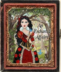
Enchanted Affaire

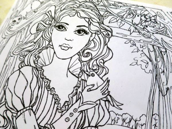
And I reworked the sketch for this painting to make it "coloring friendly".   Which involved printing the sketch, and removing all the shading, redrawing the black outlines sharper, and using white ink to cover up some areas, then scanning it again, printing it over, and doing that same process again, until all of my lines were the way I wanted them to be and were easy to follow for anyone to fill in.  

I probably should have just started over from scratch instead of spending so much time redoing this page, but this picture of Snow White has a special place in my heart.  And honestly, I wanted to color one myself….

Cp 006

So far, I haven't had a chance to do that.  Things have been busy around the cottage.  Just a typical stuff, like a roof caving in at my son's house, and all of his belongings covered in black mold spores, so that he had to move out and move here temporarily.  It has been rough on his family, but I'm glad that we have plenty of space for them here while they are unsettled and have no roof.

And lucky too, that we have an extra garage that we don't need to park in for summertime so they can store their stuff in it, as well as a big yard to spread out a tarp and let all of their belongings bleach in the sunshine.  They spritzed it all with vinegar and let the sun cure the mold spores.  And are now waiting to see if the landlord will release them from their lease.   

Dewdrop is coming back this week, and Sugarwings was very worried that she would be upset when she heard about what happened to her bedroom.  It was sweet of her to think of her sister's reaction.

 On the other hand, it was a bit selfish of me to be thinking, "Oh goody, we get all the little girls here, living with us again!!"

But back to coloring…if you like coloring too, I have two fairy tale themed coloring sheets available as well as the birdie ones-  right here.  Each pair is $3, and a digital download that you  save to your computer and can print out at 5×7" or 8×10" as many times as you'd like. 

If you are anything like me, you'll be printing out multiples and coloring them over and over again, because you never get the same result twice, and it is a relaxing, creative little hobby.

I hope to have more added in the next few weeks. These are fun to make, as well as to color!
Following Links

paintings

Securedownload

Hope helped me clean up my side bar recently. I asked her about adding some little buttons in a block that held all of my "follow me" links instead of having the long row of ugly connections that were on there at the time.

She suggested that I draw them instead of using the official symbols. Thanks for the good idea, Hope!

Type

After Hope got them on the side bar, she thought the text was a little too small, and we should change the box to hold two buttons across a row instead of three. But that would make the box uneven, so I decided to add a Typepad follow button for symmetry.

Which is a good thing to have anyway, I just never added one before.

So…. if you aren't a follower, it's pretty easy to become one now. Just click on your preferred venue and sign up!

And if you are already a follower, thank you.


If you are wondering why I slurp and spit when I talk…. and some thoughts on aging

Dew Drop, family, paintings

Toothlesss

Yep, this is me right now. 

Ouch!

And Uck!

A while back, I carelessly jumped up on a stool to get something out of a cabinet (without realizing the door had been left open) and whacked myself in the face. I had a bloody nose, black eye, but my mouth looked fine, even though that is where it hurt the most.

Then, one day, weeks after the incident, I took a bite of a popsicle.  And my front tooth flew out of my mouth, bounced off a door, and ricocheted across the room. Apparently, I'd damaged the root when I smacked my face into the cabinet door, and the tooth was just waiting for a reason to fling itself of my mouth.  

Yardwork 006

My dentist gave me a temp that was my own tooth glued to something that looks like a bleach tray, which I had to take out if I wanted to eat. Then, he had this temporary partial made, which I was quite happy with even though I don't talk, or eat well with it.  I've been practicing saying "Five, fat fairies in the food forest sat sipping cider slushies."

 My "f"s have gotten a little better, but my "s"s still sound slurpy.  

Since then, I've had some reconstructive surgery, and hopefully will have the two front teeth redone this summer.  Somehow, messing with one, messes with the other front tooth too. Sadly, I had just gone through major repairs on these two teeth and surrounding gums a year ago.  And now am paying for the same two teeth to be redone again. And the specialist has warned me that I won't get the same look, that  it can't look as natural as before.

Photo (2)

 I keep telling myself that I am extremely lucky to have good dental insurance, and money to pay the deductible. That while this is unpleasant, much worse things could happen, and if it doesn't look as good as before, at least I don't have to be without a tooth forever. Since I've lost my own tooth, I've noticed other people without teeth, and I have a feeling that they might not be as lucky as I am, and are not getting theirs fixed any time soon.  Or getting such a nice looking, temporary solution like I have.

Still, I've been a bit down about it all.  I'm really trying to not let this gap in my smile stop me from smiling.  I've also been nervous about the dental appointments, which isn't like me at all.  I don't mind dental work, but this time, I've been thrown by it.

11058658_10153184934049477_7240160232527453886_n

 I'm not as vain as I should aspire to be.  I go out without makeup, I don't dress up as nicely as I should, or take my gym membership seriously.  

And while at first, I was horrified when Dewdrop started playing with the crepey folds on my neck like I was made of play dough, I soon got over it and laughed with her and realized that this would be a happy memory for her, that she would always think of her Grammy's neck as something entertaining, and that that Grammy's lap was a good place to be.  And I know how much she loves play dough.

My tooth will be fine, my smile will be fine.   I have a lot of reasons to smile and a lot of people to smile with.

So what if it doesn't look as good as it was before, most of me isn't as good as I was before anyway.  It seems like weekly, I see or feel something age, slip, ache, or change somewhere in my body. 

Still, I do have some vanity that is bothered by all of it.  The tooth trauma has been  a little quite depressing. But I'll get over it.

 And the grand fairies kind of like it. I can play Nanny McPhee or be a wicked witch when I slide my temporary tooth out.  I'll just need a stick on wart to complete the picture. Or just wait a few weeks and see what nature provides as my sun loving youth comes back to haunt my aging skin….


Farewell to a furry friend

dogs, paintings

Photo (3)

Miss Pearl, best friend to Debbie Dusenberry was a Kansas City antiquer's icon.  Debbie is a queen of the vintage scene and everywhere she was, there was Pearl. I'll miss seeing her fuzzy little face around town.

IMG_1479

Here is a photo of her when she was a visitor at the cottage one time. Pearl always came along when Debbie visited us here.

My heart goes out to Debbie for her loss.

I used my Hello Watercolor ap on iPad to do this finger painting of Pearl..

Photo (2)

The ap is very interesting, and you can more tell from the rough sketch that I started with, just how much it looks and acts like real paint. Except with no brush. You use a fingertip or stylus to paint with. You can chose different brush-like features, and sizes, and whether you are using wet or dry, to get just the look you want.  My problem with it, is that I can't quite get the paint detailed enough, so I switch to the colored pencils function to add the finer details and sharper lines at the end.

I think a lot of people get to this point of a painting (the sketch) and think it looks awful, or nothing like what they want it to.  Sometimes newbies don't realize that most artwork is all about the details or the layering.  There is often a point near the beginning when you are horrified at what is on the page and think about stopping. The trick is to not give up, and to not judge the end by the early stages.

 This painting has a heavy use of white pencil over the underpainting. In real watercolor that doesn't really happen, you need to save your white paper. The ap can be much easier to use than real paint. It even has an eraser.


Family art

collections, cottage, family, paintings

Mary1920

While redoing the guest room (like I said, it never ends, a redo steam rolls!), I gathered up some old family photos and drawings that had hung in there and moved them to make a display in my stairway.

This is a drawing I did of my grandma about 30 years ago, from a photo of her as a young girl. The frame had broken, so while it was out, I gave it a little revamp with some color pencils and I've done a bit of digital editing to it, by cropping and adding a background of text from a handwritten note by her mother.  I'm going to reframe it to go with the rest of the pictures on the wall.

Cottageguestroom 029

This is how it looked before I added to it.

Of course, the original doesn't have the text, that is just in the digital copy. But I did add color by hand to the original, not digitally.

Cottageguestroom 030

This sketch is of my dad's mom, that I did at 16.  

Cottageguestroom 032

This is a watercolor of her husband, my grandfather Harry, done a couple years later.

Cottageguestroom 031

And a quick sketch of Ryan as a little boy.  (with his Kevin Bacon hairstyle, he LOVED Footloose as a kid)

Cottageguestroom 033

This one is a watercolor that I did of a photo of my husband's grandmother, Gladys. The photo sits on a quilt that she had made. 

Cottageguestroom 034

The collage of my sisters and I is a more recent work, but not all that recent.  7 years ago, maybe? Before I discovered photo editing, that photo I used of us is kind of dark.  We are standing by a road sign for Downey street, our maiden name.

Cottageguestroom 027

As I was hanging the pictures in the stairway, I knew that not a single art piece was a good example of work, and that none of the frames went together well. It is a hodge podge grouping, of some cool,  some cheap frames, some really nice antique frames, old photos, and some so-so drawings, that don't really have a cohesive look together.

But all are meaningful to  me.  And a home can't  have all perfectly groomed decor, or it becomes a showhouse, not a home.   My house will always have a place for so-so artwork, family mementos, and sentimental items.  Even if they aren't the prettiest items around. Maybe someday, I'll reframe them all in a better way, but for now, I just enjoy walking by them and seeing them as is.


PS- I've got 50% off the Boutique right now. But you MUST use this link:


 http://www.karlascottage.com/?code=Fling


to get to the sale site.  If you go through the regular link, the 50% off won't register. If you can't click on it to get to the page, you might want to try cutting and pasting it to your browser. Thanks for helping me spring clean!


Scroll to Top